Microinteractions in UI: Adding Delight to User Interfaces
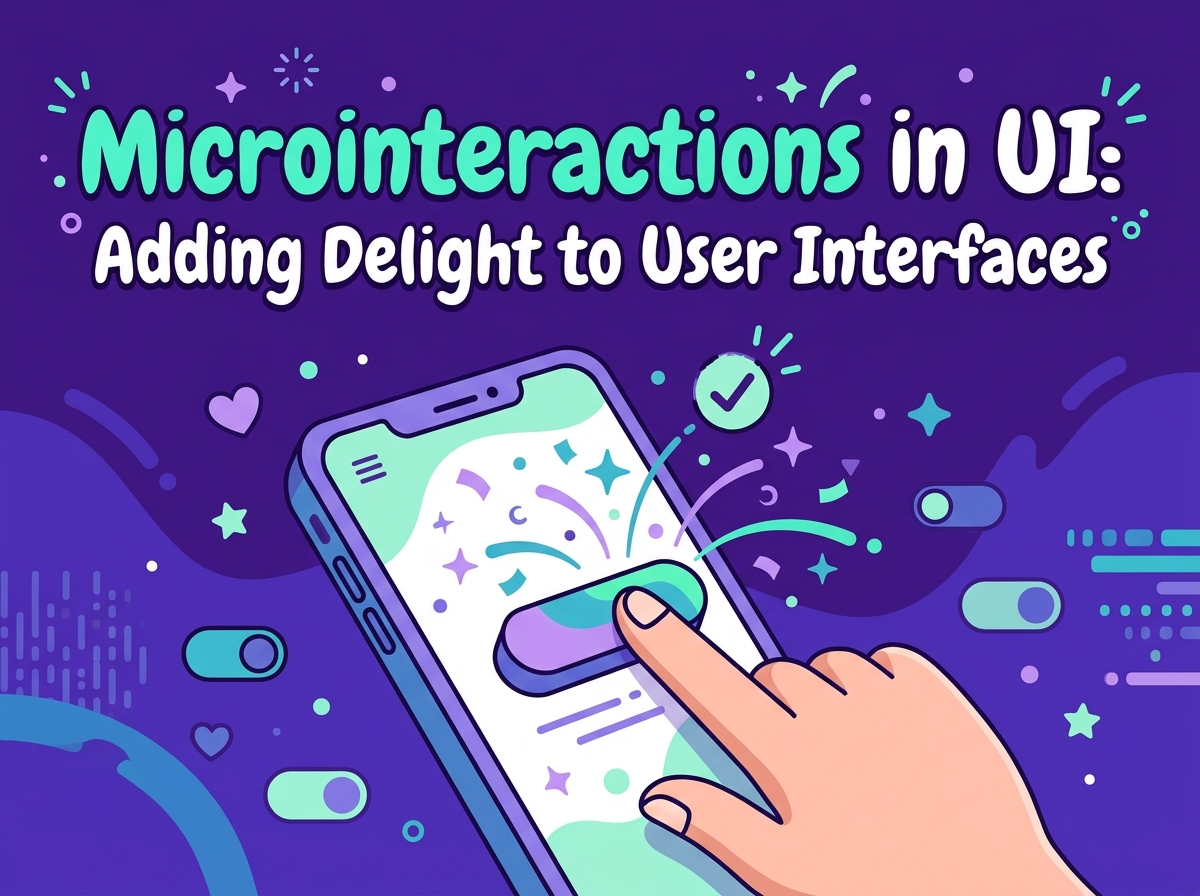
You have felt microinteractions even if you have never heard the word. The button that dips when you tap it, the heart that bursts when you like a post, the little tick that confirms your message was sent: these tiny moments are microinteractions, and they quietly shape how a website feels. They sit within what UI design is at its best — an interface that responds to people like a good conversation partner.
What Microinteractions Are
A microinteraction is a small, contained moment built around a single task: switching a setting on, refreshing a feed, entering a password. Pull-to-refresh on a phone, the progress bar during an upload and the gentle shake when a password is wrong are all examples.
Individually they last a second or less. Together they decide whether an interface feels responsive and alive, or flat and indifferent.
Each one follows a simple pattern. Something triggers it — a tap, a swipe, a submitted form. The interface responds in a way that matches what just happened. And the response carries information: it worked, it is working, or something needs your attention. When any part of that pattern is missing, people notice. A button that gives no sign of being pressed gets pressed twice; a form that fails silently leaves visitors wondering whether their enquiry vanished into the void. Microinteractions exist to close those little gaps in the conversation between a person and a screen.
The Four Jobs of a Microinteraction
Feedback. The most basic job: confirming that something happened. A button that changes as it is pressed, or a “Saved” note that fades in, tells visitors their action landed and nothing was lost.
Guidance. A subtle bounce on the next step, or a field that highlights as you reach it, steers people through a process without a single instruction. Good guidance feels like help; bad guidance feels like nagging.
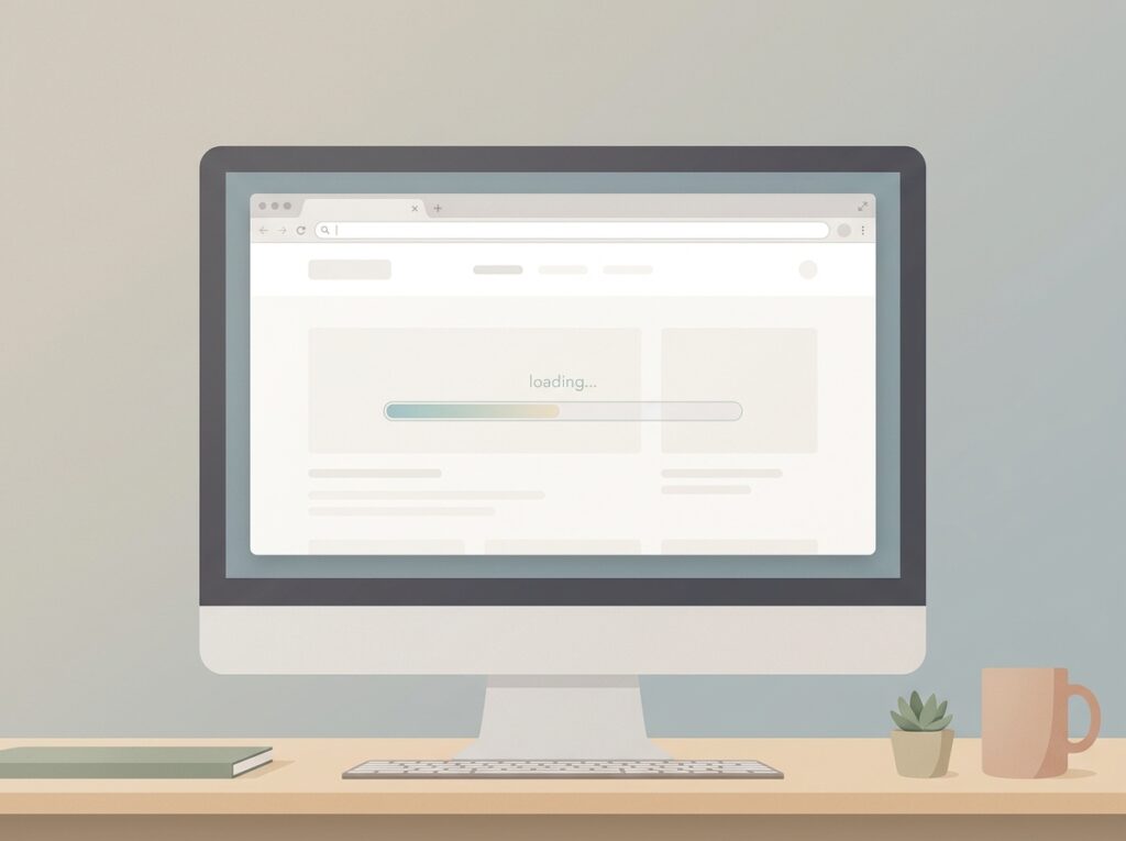
Status. Progress bars, loading spinners and “uploading… 70%” messages show the system is working. People wait far more patiently when they can see something happening.
Personality. A playful animation on a success screen, or a warm message after checkout, adds a human touch. Used sparingly, it makes a business feel friendly rather than mechanical.

Everyday Examples on Small Business Websites
- Form confirmations: A green tick beside an email field as it is completed correctly, so visitors fix mistakes as they go rather than at the end.
- Add-to-basket animation: The product thumbnail glides to the basket icon, confirming the item was added without interrupting the shopping.
- Menu transitions: A mobile menu that slides open smoothly feels deliberate; one that snaps or stutters feels broken.
- Success ticks: A simple animated tick after sending an enquiry reassures visitors that their message is safely on its way.

The Design Rules: Small, Fast, Quiet
Microinteractions follow the same spirit as the wider UX design principles: help the visitor, never hinder them. Keep them quick — a fraction of a second, not a short film. Keep them subtle enough that the tenth viewing is as comfortable as the first. Keep them consistent, so the same action always gets the same response. And respect visitors who enable reduced-motion settings on their devices: for them, animations should calm down or switch off entirely.
When Not to Use Them
Skip microinteractions when they delay the task, repeat so often they become irritating, or decorate something serious. A playful bounce on a payment error helps nobody. Animation on every scroll, hover and click quickly turns delight into noise — if everything moves, nothing feels special, and some visitors will simply feel queasy. When in doubt, leave the effect out and test the plainer version first. A useful test: if you removed the animation entirely, would anything be lost besides decoration? If nothing would, it probably never needed to move.
Frequently Asked Questions
Do microinteractions slow a website down?
Simple ones barely register. Problems come from heavy animation libraries and effects running constantly. Keep them light and they cost almost nothing.
Are microinteractions just decoration?
No. The best ones do a job — confirming, guiding or informing. Decoration is the bonus, not the purpose.
Can I add microinteractions to an existing website?
Usually, yes. Button responses, form feedback and success confirmations can often be added without redesigning the whole site.
How many microinteractions should a page have?
Only where an action needs acknowledging or a visitor needs guiding. A handful of well-chosen moments beats animation everywhere.
Key Takeaways
- Microinteractions are the small responses — taps, ticks, progress bars — that make an interface feel alive.
- Their jobs are feedback, guidance, status and a touch of personality.
- Keep them fast, subtle, consistent and respectful of reduced-motion settings.
- Never let animation delay a task or decorate a serious moment.
If you would like a website that feels responsive, friendly and quietly delightful to use, explore our web design service and see how Designores sweats the small details.