
Using Color and Contrast in UI for Better Usability

Picture a potential customer on a sunny street, phone in hand, trying to read your opening hours. If your website uses pale grey text on a white background, those hours may as well not exist.
Contrast means making sure text, buttons and other elements stand out clearly from whatever sits behind them. If you have chosen brand colours for your business, the next step is checking they still work as body text, links and buttons on a screen.
What Contrast Actually Means
Contrast is the difference in lightness between two colours. Black text on white has the strongest possible contrast — why books have used it for centuries. Light grey text on white sits at the other end: so close in lightness that the letters blur into the page.
Think of it as volume: high contrast is clear speech; low contrast is mumbling in a noisy café, where you strain to catch the words — and strained visitors leave.
Why Low Contrast Hurts Real People
Low contrast rarely causes problems in the design studio, where screens are large and bright. Your customers live in different conditions.
- Bright light: Sunlight washes out phone screens, and faint text disappears first.
- Older eyes: Eyes grow less sensitive to contrast with age, so text a young designer finds fine can be hard work for older customers.
- Small screens: Text shrinks on phones, and small, faint letters are hardest to read.
None of them will write to tell you. They simply move on to a competitor whose site feels effortless.

What the Accessibility Guidelines Suggest
The Web Content Accessibility Guidelines, or WCAG, measure contrast as a ratio between lighter and darker colours. Aim for at least 4.5 to 1 for ordinary body text; large headings can manage with around 3 to 1, as bigger letters are easier to read.
Treat these figures as a practical target, not a legal trap. They are used in accessibility work, including discussions around ADA compliance in web design, and give a testable standard: a pairing either passes or needs adjusting.

Do Not Rely on Colour Alone
Contrast is only half the story. Problems also appear when colour alone carries a message. A form that marks mistakes only by turning fields red gives no clue to visitors who cannot distinguish red from green, and a chart separating product lines by colour alone leaves some readers guessing.
The fix is simple: back colour up. Add a label or icon beside the colour change, underline links instead of relying on colour alone, and make error messages say what is wrong.
Buttons That Look Like Buttons
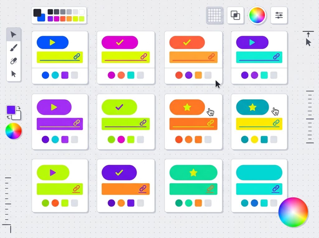
Buttons carry your important actions — buying, booking, sending an enquiry — so they deserve the strongest treatment. Use a colour that stands apart from the background, with label text that contrasts well against the button itself. Keep one colour for main actions and reserve it for actions only, or buttons get lost among lookalike headings and banners.
Simple Checks You Can Do Today
No specialist software needed — try these checks:
- Take your phone outside: Read your key pages in bright daylight. Anything you squint at needs attention.
- Turn the brightness down: Halve your screen brightness and check the text is still comfortable.
- Use a free contrast checker: Paste in two colours to see the ratio and if it passes.
- Try the greyscale test: View a screenshot in black and white: text and buttons should still stand out.
- Ask someone outside the design world: A friend with everyday eyesight beats any software score.
Common Mistakes to Avoid
- Light grey body text: Fails in sunlight and for older eyes. Save pale greys for borders and backgrounds, not words.
- White text over photographs: Some letters land on light patches, others on dark ones. Add a solid panel or darker overlay.
- Brand colours as text: Lovely in a logo, but often too faint at paragraph size. Use a darker shade for text.
- Placeholder-only labels: It vanishes once someone starts typing, and is usually too pale to read anyway.
Frequently Asked Questions
What is a good contrast ratio for website text?
At least 4.5 to 1 for body text, 3 to 1 for large headings. Darken the text or lighten the background to fix a failing pairing.
My brand colour is quite pale. Do I have to change it?
No. Keep pale brand colours for backgrounds and decoration, and use a deeper shade from the same family for text and buttons.
Can I just make all my text black?
Black on white is safest for long passages, but brands usually want character in headings, links and buttons. Just check each pairing you use.
How do I know if my current website has a contrast problem?
Run your colours through a free contrast checker, read your pages in daylight, and view a greyscale screenshot. Squinting means visitors struggle too.
Key Takeaways
- Contrast measures how clearly text and controls stand out from their background.
- Sunlight, small screens and older eyes expose weak contrast.
- Aim for 4.5 to 1 for body text; large headings need less.
- Never let colour carry a message alone — add labels, icons or underlines.
If you would like an experienced eye on your website’s readability, talk to Designores. Through our web design service, we build sites where colour looks the part and works hard too.





One Comment