Choosing Brand Colors: A Guide to Effective Color Schemes

Choosing brand colours looks like a matter of taste, and that is exactly the trap: favourites get picked, a palette is declared, and only later does anyone ask whether the colours suit the business, the audience or each other. In practice, choosing well is a process, not a moment of inspiration. This guide walks through it step by step: start from your brand’s personality, build a balanced scheme, combine colours using a few reliable recipes, check contrast, test on real materials, and record the result so it stays consistent.
Start With Personality, Not Swatches
Before opening a colour picker, write down the three feelings your brand should create — calm and trustworthy, bold and energetic, warm and welcoming. Those words are your brief. Then consider your audience and your sector: customers carry expectations (finance feels safe in blue, play feels right in brights), and you can either meet those expectations or deliberately stand out from them — but it should be a choice, not an accident.
For this stage, a little colour psychology goes a long way: it explains the associations each colour carries, so you can shortlist shades that say the right thing before you worry about combining them.
Build the Scheme: A Lead Colour, Support and Neutrals
Most workable palettes have the same anatomy. One primary colour does the heavy lifting — it appears on your logo, signage and headings, and becomes the colour customers associate with you. One or two supporting colours add variety for backgrounds, highlights and secondary materials. Neutrals — white, off-white, greys, sometimes a warm beige or charcoal — carry text and give the stronger colours room to breathe.
A handy rule of thumb for using them is 60-30-10: roughly 60 per cent neutral or background, 30 per cent your primary colour, 10 per cent an accent for calls to action and highlights. It is a guideline borrowed from interior design, not a law — but it stops the common failure where every colour shouts at equal volume and nothing stands out.
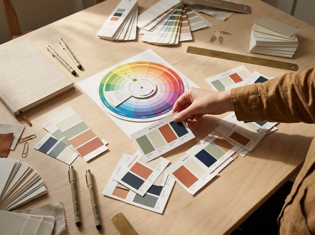
Combining Colours: Three Reliable Recipes
If choosing individual colours is step one, combining them is where palettes succeed or fail. Three classic combinations cover most brands:
Complementary — opposites that energise. Colours opposite each other on the colour wheel (blue and orange, purple and yellow) create strong contrast and energy. Let one dominate and use the other sparingly as an accent, or the result vibrates rather than communicates.
Analogous — neighbours that harmonise. Colours side by side on the wheel (blue, teal and green) feel calm and coherent — good for wellness, nature and professional brands. The risk is mushiness: make sure one colour clearly leads and that shades differ enough to stay distinct.
Monochrome — one hue, many depths. Tints and shades of a single colour, plus neutrals, look elegant and are hard to get wrong. Add contrast through depth — very light against very dark — so materials never feel flat.
Whatever recipe you choose, test the scheme against your logo early: the logo is where clashes show first and where the primary colour must work hardest.
Contrast and Accessibility
A beautiful palette that nobody can read is a failed palette. Text colours must contrast clearly with their backgrounds — dark text on pale grounds, pale text on deep colours — and the combinations matter more than any single colour. Check every pairing you actually use, not just the swatches side by side.
Remember too that a significant minority of customers have colour-vision deficiency and may not distinguish reds and greens, or blues and purples. Never let colour alone carry essential information: pair it with labels, icons or position, so prices, statuses and warnings stay clear to everyone.
Test Colours on Real Materials
Colours behave differently in the wild than on your screen. Screens emit light and look bright; print absorbs it and usually comes back duller and warmer. A shade chosen on a phone can look different on a shop sign in daylight, on packaging under shop lighting, or shrunk to a social media avatar.
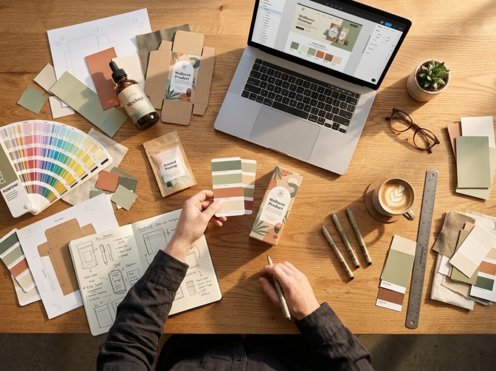
So before committing, proof the palette properly: print samples, mock it up on your website and packaging, and view everything at real sizes. It is far cheaper to adjust a shade now than after the signage is made.
Record the Codes — and Keep Them Safe
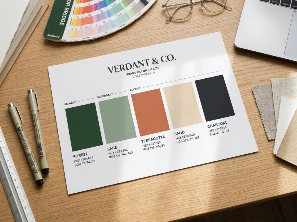
Once chosen, colours only stay consistent if they are written down exactly. Record each colour’s codes: HEX for websites and digital design, RGB for screen use, and CMYK for print. Note which colour is primary, which are supporting, and the pairings that are approved — and which are not.
Those details belong in your brand style guide, even a short one, so that anyone designing for you — staff, printers, freelancers — reproduces the same colours instead of eyeballing a near-match that slowly drifts.
Common Mistakes to Avoid
- Choosing personal favourites only. Your favourite colour must still fit your audience and sector — the palette speaks to customers, not to you.
- Using too many colours. Five competing colours say nothing clearly; restraint is what makes a palette recognisable.
- Copying a competitor’s palette. You will look like a weaker version of them, and blend into the very shelf you wanted to stand out on.
- Judging shades on one screen. Phone and monitor displays vary; always check a printed proof before approving print work.
- Skipping the record. Unrecorded colours drift within months, and the brand quietly becomes inconsistent.
Quick Checklist
- Three brand feelings written down before any swatches were opened
- One primary colour, one or two supporting colours, plus neutrals
- Combination follows a recipe: complementary, analogous or monochrome
- Every text/background pairing checked for readable contrast
- Meaning never carried by colour alone (labels or icons added)
- Palette proofed in print and on screen, at real sizes
- HEX, RGB and CMYK codes recorded in the style guide
Frequently Asked Questions
How many colours should a brand palette have?
Usually three to five in total: one primary, one or two supporting colours, and neutrals. More than that becomes hard to apply consistently; fewer can work for deliberately minimal brands.
Can I just use my favourite colour?
As a starting point, yes — then test it like any other candidate. Does it fit your sector, appeal to your customers, pair well and stay readable? If it passes, keep it; if not, use it in your personal stationery instead.
Should my colours match or avoid my competitors’?
Either can be right. Matching category norms helps customers place you instantly; standing out wins attention in a uniform market. The mistake is drifting into a near-copy by accident — decide deliberately.
Do I need different colours for print and online?
The same colours, expressed through different codes: HEX and RGB on screen, CMYK in print. Because print renders duller, proof printed samples and adjust the shade if it loses its character.
Conclusion: Choose Deliberately, Then Stay Consistent
Good brand colours are rarely a lucky guess. They come from a short, deliberate process: personality first, a balanced scheme, proven combinations, honest testing and a written record. Do that once, properly, and colour stops being a recurring argument and becomes one of your most recognisable assets.
If you would like help building a palette that fits your brand, Designores is a full-service design studio that has completed 1,600+ projects for 900+ companies, including colour schemes and full brand identities for small businesses. Get in touch when you are ready.