Prototyping UX: Tools and Techniques for Better Design

Discovering after launch that visitors cannot find the checkout button is an expensive way to learn. A prototype lets you rehearse: a rough, testable version of your pages that real people can try before anything is built. Moving a button in a sketch is far cheaper than rebuilding a finished page.
Prototyping sits on the UX side of design — the flow, structure and ease of the journey — rather than final visual polish. If the vocabulary is new, our plain-English guide to UX vs UI explains more.
What a Prototype Is — and Is Not
A prototype is not a finished design. It is a working model built to answer questions: can a first-time visitor find the prices? Does the booking flow make sense in this order? Where do people hesitate?
So keep it quick and cheap. The moment a prototype becomes precious — polished for weeks, defended in meetings — it stops doing its job. Its value lies in being wrong early, while being wrong costs almost nothing.
The Fidelity Ladder: Four Stages
Designers talk about fidelity: how close a prototype is to the finished thing. Each stage answers different questions.
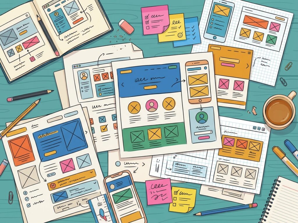
- Paper sketches: Hand-drawn screens made in minutes — ideal for trying several layouts and discarding weak ones.
- Wireframes: Plain computer layouts — boxes, headings and buttons in grey, no branding. They test structure and content order, undistracted by colour.
- Clickable prototypes: Screens linked so tapping a button moves you on, like a real site. These test complete journeys: signing up, checking out.
- High-fidelity mock-ups: Near-final designs with real colours, fonts and images. They test whether the look is clear, and give developers an exact reference.
What to Test at Each Stage
Match the question to the stage: early stages cannot answer detailed questions.
Paper sketches test the shape of the journey. Are the steps in order? Is anything missing, like a confirmation screen? Volunteers talk through them, pointing where they would tap.
Wireframes test layout and priority. Is key content where eyes land first? Can people spot the main action without colour to guide them?
Clickable prototypes test complete tasks. Give someone a goal — book an appointment, find a price — and watch if the screens carry them there.
High-fidelity mock-ups test clarity and feel. Is text readable, do buttons look pressable, and does it feel trustworthy enough to buy from?
Checking findings against established UX design principles shows what matters most.
Tools Designers Commonly Use
The best-known tools are Figma, Adobe XD and Sketch: all let designers link screens into clickable flows, and Figma suits teams because several people can comment on one file. Which tool a studio uses matters far less than whether it prototypes at all.
Paper, pens and a whiteboard remain the fastest way to explore ideas, and sticky notes make rearranging a journey easy. Plenty of excellent websites began as pencil sketches.
Simple Testing Techniques That Work
No research lab needed: a handful of people and a quiet hour surface the biggest problems.
Set a task, not a tour. Ask them to do something real: “Imagine you need to book a table for four on Friday.” Their choices reveal what the design communicates alone.
Watch in silence. A hesitation is the information you came for, so resist helping when someone stalls. Note where they pause, backtrack or guess.
Write down what happens, not opinions. “Three people looked for prices under Services, not Products” is useful; “people liked it” is not. Patterns point at the fixes that matter.

What to Do With What You Learn
Testing only pays off if findings change the design. List the problems, then fix first whatever stopped people completing a task, or that several testers hit. Small fixes — renaming a button, moving a link to where people looked for it — often make the biggest difference.
Then test again: a second round confirms the fix worked and sometimes reveals the next issue behind it. Two or three loops cost far less than launching with a flaw and rebuilding later.

Frequently Asked Questions
How long does prototyping take?
Sketches take an afternoon; a clickable prototype of a small site takes days, not weeks — and saves time by preventing rework.
Do small business websites really need prototypes?
Not every page, but your key journeys do — buying, booking, enquiring. A quick prototype of those screens is cheap insurance against confusion at launch.
What is the difference between a wireframe and a prototype?
A wireframe is a static layout. A prototype links screens so you can click through the journey as a visitor would.
Can I test a prototype with my own customers?
Yes — often the best testers available, as they know your business but not the new design. Ask a few to try a task while you watch.
Key Takeaways
- A prototype is a cheap rehearsal of your site or app that finds problems before building begins.
- Climb the fidelity ladder — paper, wireframes, clickable prototypes, high-fidelity mock-ups — testing the right questions at each stage.
- Tools like Figma, Adobe XD and Sketch help, but paper and a whiteboard are fine places to start.
- Test with real tasks, watch in silence, and record behaviour rather than opinions.
Planning a new website? Talk to Designores. Through our web design service, we prototype and refine key pages first, so customers can use your site with confidence from day one.