8 Tips for Designing a Memorable Business Logo

A memorable logo is not an accident, and it is rarely the most complicated option on the table. The logos people remember share a handful of qualities: they are simple, distinctive and built to survive real-world use — tiny on a phone screen, huge on a sign, printed in one colour on a box. Whether you are briefing a designer or judging concepts yourself, these eight tips will help you spot the designs that last.
Tip 1: Keep It Simple
The golden rule of logo design is restraint. Simple logos are recognised faster, remembered longer and reproduced more reliably than complicated ones. Every extra detail is something else to misprint, squash or lose at small sizes. Aim for a mark a customer could roughly sketch from memory. Simple does not mean plain or generic — the best simple logos carry one strong idea, executed cleanly. If a concept needs a long explanation, it is doing too much.
Tip 2: Build It Around One Idea
Memorable logos stand for one thing. A bakery might lean on warmth, a security firm on protection, a courier on speed — but a logo that tries to say everything ends up saying nothing. Before judging any design, write down the single impression you most want to leave. Then check each concept against it: does this mark make that impression stronger, or is it decoration? Concepts that survive this test are the ones customers can describe — and describing is remembering.
Tip 3: Design for Versatility
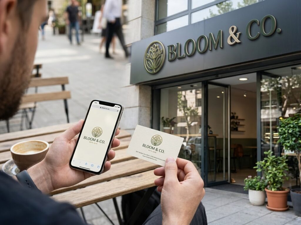
Your logo will live in more places than you can currently imagine: a website header, an app icon, a uniform, an invoice, a social media avatar. A versatile design holds up in all of them. Ask for a small family of versions — a main logo, a stacked or compact version, and an icon-only mark — all clearly the same brand. If a concept only works in one layout, in one place, it will fail you within a year.
Tip 4: Make It Work in Black and White
Colour is the last thing to add, not the first. A strong logo works in solid black, solid white and single-colour print, because that is how it will often be used: photocopies, engraving, embroidery, receipts, a dark background, a light one. Design in black and white first; if the idea survives without colour, colour can only strengthen it. If it collapses, no palette will save it.
Tip 5: Make It Appropriate for Your Audience
A logo does not need to please you — it needs to land with the people you serve. Playful lettering suits a children’s party company and undermines a firm of solicitors; neither is wrong, both are about fit. Remember too that your logo sits inside a wider brand identity — it must sit comfortably alongside your colours, fonts, tone of voice and the promises your business makes. Judge concepts as your customers will see them, not as you would frame them.
Tip 6: Choose Timeless Over Trendy
Every year brings fashionable effects: gradients, textures, a new favourite typeface. Borrow lightly if you must, but do not build your identity on them — trends date, and a logo should serve for years. Ask of every concept: will this look deliberate in ten years, or like a leftover? Restraint, strong proportions and a clear idea age well; decoration borrowed from this year’s fashion rarely does.

Tip 7: Take Typography Seriously
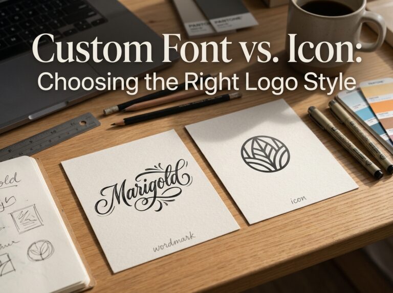
For many businesses the name is the logo, which makes lettering the design. Choose a typeface whose character matches the business — sturdy, elegant, friendly, technical — and check the details: spacing, the shape of key letters, how it reads in capitals and lowercase. Customising even one letter can make a standard font ownable. And whatever you choose must stay legible at the smallest size you will ever use it.
Tip 8: Test It Everywhere Before You Commit
Never approve a logo from a presentation screen alone. Print it at the size of a postage stamp and at the size of a shop sign. Put it on a photo, a dark background, a busy one. Show it to people who have never seen it, then ask a week later what they remember. These checks catch failures that only appear in the real world — and real-world testing is built into a professional logo design process from the start.
Quick Checklist
- One clear idea a customer could describe after a single glance
- Simple enough to sketch roughly from memory
- Works at favicon size and at shop-sign size
- Works in solid black, solid white and one colour
- Main, compact and icon-only versions all available
- Typeface matches the brand’s character and stays legible small
- Fits the audience and the wider brand identity
- Tested on real items, with real people, before approval
Frequently Asked Questions
How many concepts should I ask a designer for?
A small number of genuinely different directions — two or three — is usually better than a dozen near-identical options. Too much choice makes the decision harder, not better. What matters is that each concept explores a different idea.
Can a logo be too simple?
A logo can be generic, which is a different problem: simplicity only fails when nothing distinguishes the mark. The goal is the simplest version of your idea, not the simplest logo possible. If a competitor could swap in their name and nothing would look wrong, push further.
Should my logo show what my business does?
Not literally. Some of the most memorable logos are abstract or symbolic — they gain meaning through use, not illustration. What matters is that the style fits your audience and your trade. A literal picture can help a new, local business be understood quickly, but it can also box you in if your services change.

Conclusion: Simple, Distinctive, Tested
Memorability is not a talent some logos have and others lack — it is the result of decisions: one idea, kept simple, built to work everywhere and tested before it is trusted. Apply these eight checks to any concept put in front of you and the forgettable options will fall away quickly.
If you would like that process handled for you, Designores is a full-service design studio with 1,600+ projects completed for 900+ companies. Get in touch when you are ready to be remembered.