Creating a Brand Style Guide: Tips and Best Practices

Your logo was designed once, but it gets used hundreds of times — by staff, freelancers, printers and partners. Without written rules, everyone improvises: the logo gets stretched, the “blue” becomes five different blues, and each document uses a different font. A brand style guide stops that drift. It records how your brand should look and sound, so every touchpoint stays consistent whoever creates it. Here are the sections it needs, how to build one, and the brand style guide tips that make people actually use it.
What Is a Brand Style Guide?
A brand style guide (often called brand guidelines) sets out the rules for using your brand: which logo version to use, your exact colours and fonts, your imagery style and tone of voice.
It is a working reference, not a design trophy. Your team, freelancers, developers, printers and social media managers all use it — and a good one lets a newcomer create on-brand work on day one without asking you a question.
Why Your Business Needs One
- Consistency. Customers recognise and trust brands that look the same everywhere — website, invoices, shopfront and adverts, unmistakably yours.
- It saves time. Nobody hunts for the right logo file, guesses a colour, or redoes work that came back off-brand.
- A more professional image. Consistent materials look deliberate; improvised ones look careless — and customers notice.
- Easier outsourcing and onboarding. Freelancers and new staff get it right first time, because the rules are written down, not living in your head.
The Essential Sections of a Style Guide
A small business guide does not need 80 pages — just these six sections, covered clearly.
1. Logo Usage
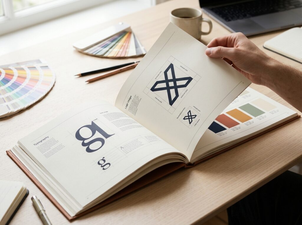
Show the primary logo, any secondary or stacked versions, and an icon-only version if you have one. Set the clear space around it (say, the height of one letter on all sides), a minimum size so it stays readable, and the backgrounds it can sit on. Then show the don’ts with pictures: don’t stretch or squash it, don’t recolour it, don’t add shadows, and don’t place it on clashing backgrounds.
2. Colour Palette
List your primary colours (usually two or three) and secondary colours for backgrounds and accents — each with its codes, because “navy blue” is not precise enough:
- HEX (e.g. #1B3A5C) — for websites and digital design.
- RGB — for screens and presentations.
- CMYK — for professional printing.
Note approved combinations, such as white text on your primary colour, and pairings to avoid for weak contrast.
3. Typography
Name your primary font (headings) and secondary font (body text), and show the hierarchy of heading and text sizes. Add an approved fallback — a widely available font for emails and office documents, where your brand font may not be installed.
4. Imagery and Photography Style
Describe the images your brand uses: bright and natural, or moody and dramatic? People or products? Photography or illustration? Cover icon style and treatments like duotones, and show approved examples.
5. Tone of Voice
Your guide should cover how the brand writes, not just how it looks. Define the personality — “friendly, plain-spoken, confident” — list words you use and avoid, and add a before-and-after example: “Our operatives will endeavour to respond promptly” becomes “We’ll get back to you within one working day.”
6. Brand Elements and Layout
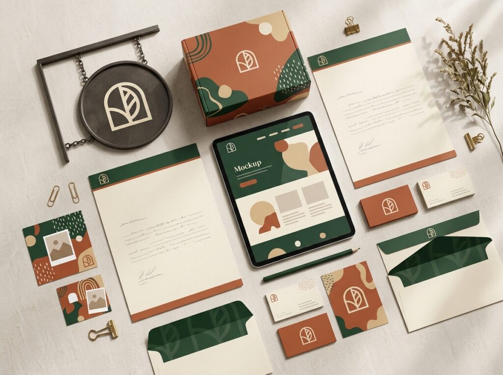
Cover the supporting pieces briefly: patterns, shapes or graphic devices drawn from your logo, standard spacing and margins, and web elements like buttons — so layouts feel related whatever the content.
How to Create Your Style Guide, Step by Step
- Gather what you already have. Collect your logo files, the colours and fonts in current use, and recent materials. If these are not yet defined, work through creating a brand identity first — a guide documents decisions; it does not replace making them.
- Decide the format and home. A shareable PDF, backed by a central folder of logo and font files. What matters is one official location, not copies scattered across inboxes.
- Document each section with visual examples. Show the logo in correct use, swatch every colour with its codes, and set real text in your fonts. Pictures settle questions; paragraphs alone invite interpretation.
- Keep two versions. A one-page quick reference (logo, colours, fonts, do’s and don’ts) for everyday use, plus the full guide.
- Share it properly. Send it to staff, freelancers and suppliers, and add it to onboarding.
Tips and Best Practices
- Make it visual, not text-heavy. A guide people can scan in a minute beats a manual nobody opens.
- Show do’s and don’ts side by side. The incorrect versions make the correct ones stick.
- Keep it usable. Cover what people genuinely need day to day. If a rule is never used, leave it out — shorter guides get followed.
- Version and date it. Put “Version 2 — March 2027” on the cover, so outdated copies are easy to spot.
- Update it as the brand evolves. New product line, new channel, a refreshed colour — record changes when they happen.
- Make it accessible. Everyone who creates for you should find the current guide and files in under a minute.

Common Mistakes to Avoid
- Making it so long it gets ignored. A 100-page guide for a ten-person business gathers dust. Thorough is good; bloated is not.
- Rules without examples. “Use the logo correctly” means nothing until people see correct and incorrect use side by side.
- Storing it where nobody finds it. One person’s hard drive is not a brand system — if the team cannot find it, it does not exist.
- Never updating it. A guide describing a logo replaced two years ago creates inconsistency instead of preventing it.
Quick Checklist
- Logo versions, clear space, minimum size and don’ts shown visually
- Every colour listed with HEX, RGB and CMYK codes
- Heading and body fonts named, with sizes and fallbacks
- Imagery style described, with approved examples
- Tone of voice defined, with words to use and avoid
- One-page quick reference created
- Guide dated, versioned, and stored in one shared place
Frequently Asked Questions
How long should a style guide be?
Long enough to cover the essentials, short enough to be used. For a small business, 8–20 pages is typical, plus a one-page quick reference.
Can a small business create one itself?
Yes, if your brand elements are already decided: gather your logo files, colour codes and fonts and document them with examples. If those were never properly defined, sort that first — it is the harder part.
What is the difference between a style guide and brand guidelines?
Very little — the terms are used interchangeably. “Brand guidelines” sometimes implies a broader document also covering mission and values, while “style guide” focuses on visual and verbal rules. For most small businesses, one document is enough.
When should you update your style guide?
Whenever the brand changes: a logo refresh, a new colour, font, product range or channel. Review it yearly even without obvious changes, and reissue it with a new version number.
Conclusion: Small Document, Big Difference
A style guide turns your brand from a set of files into a system. Six clear sections — logo, colours, typography, imagery, voice and layout — written down with real examples, and every future leaflet, post and page becomes faster to produce and instantly recognisable as yours.
If you would like the guide — or the brand behind it — built properly, Designores is a full-service design studio that has completed 1,600+ projects for 900+ companies, including the style guides that keep their branding consistent long after launch. Get in touch when you are ready.