
E-commerce Web Design: Best Practices to Maximize Conversions
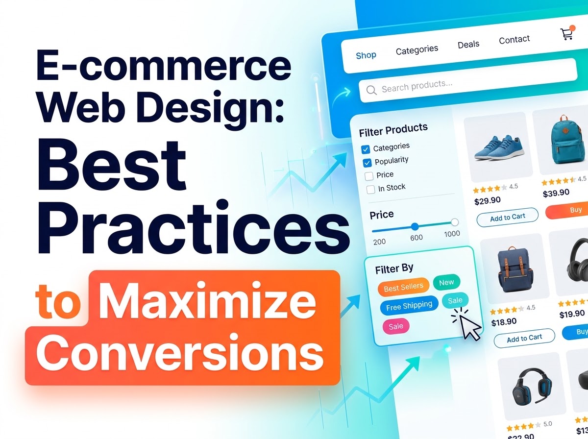
An online shop has one job: to help a visitor find the right product, feel confident about buying it, and complete the purchase without unnecessary effort. Good e-commerce web design is rarely about decoration. It is about removing doubt and friction at every step of the buying journey, from the first page a visitor lands on to the message they receive after they have paid.
The practices below follow that journey in order. None of them requires a complete rebuild. Most are small, deliberate decisions about layout, wording and structure that make buying feel easy — and easy is what turns browsers into customers.
Start with a Homepage That Points Somewhere
Your homepage is a signpost, not a catalogue. Its job is to show visitors what you sell, who it is for, and where to go next — within a few seconds of arrival. A clear headline that states what the shop offers, supported by your strongest categories or best-known products, gives people an immediate route forward.
Resist the temptation to promote everything at once. A wall of banners, pop-ups and competing offers splits attention and slows decisions. Choose one primary message, support it with a small number of well-chosen products or collections, and let everything else sit one click deeper.
Trust belongs on the homepage too. Delivery options, returns information and secure payment reassurance should be visible without hunting — a simple strip near the top or in the footer sets expectations early and quietly answers the first question every new visitor asks: is this shop safe to buy from?
Navigation and Search That Help People Find Products
Shoppers arrive in two ways: some browse, others search. Your design has to serve both. Navigation should use the plain words customers use for your products, grouped into a small number of logical categories. Clever or branded category names may look distinctive, but they force visitors to guess — and guessing visitors leave.
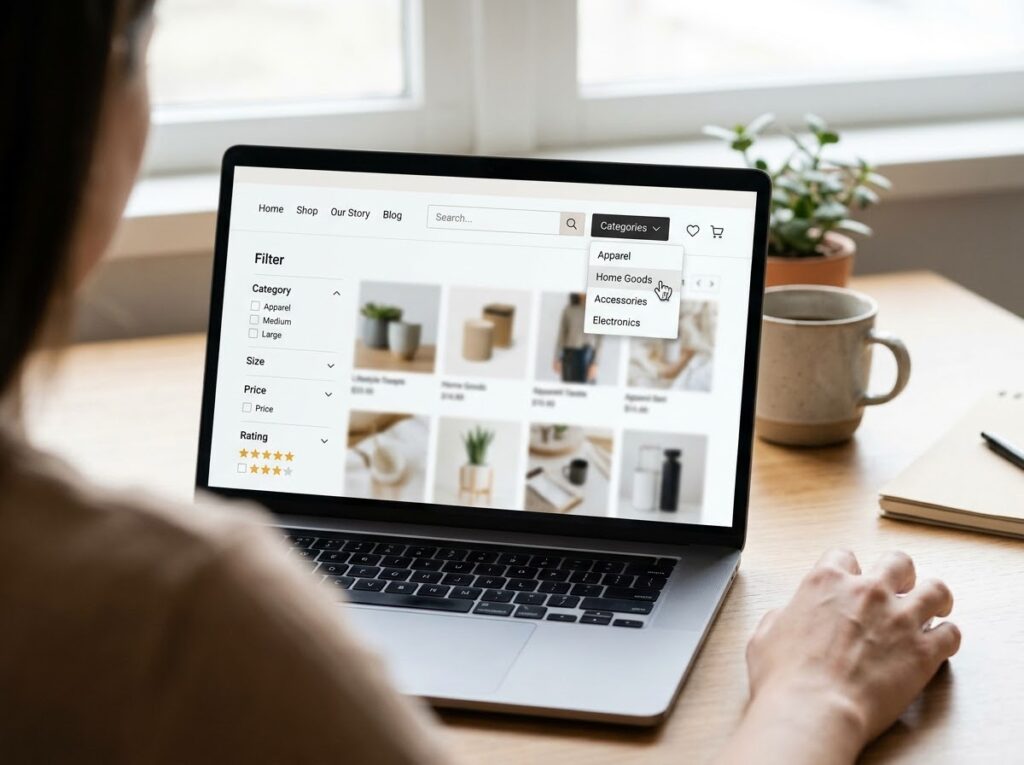
Search deserves the same care. Place the search box where people expect it, make it forgiving of spelling mistakes and synonyms, and show useful results even when a product is out of stock, with suggestions for close alternatives. Filters on category pages — by size, colour, price or feature — do the heavy lifting for browsers, letting them narrow a long list to a shortlist in seconds.
Category Pages That Make Choosing Easy
A category page is where browsing turns into choosing, so clarity matters more than novelty. Show products in a clean, consistent grid with the same information on every item: a clear photo, the product name, the price, and any detail that changes the decision, such as sizes available or a delivery note.
Consistency helps comparison. When every product card is laid out the same way, visitors can scan quickly instead of re-reading each one. Sorting options — by price, popularity or newest — and honest stock indicators help people commit to a choice rather than endlessly scrolling.
Avoid dead ends. If a category is empty or a filter combination returns nothing, say so plainly and offer the nearest useful alternative: a broader category, a related collection or your best sellers. A helpful empty page keeps the journey alive; a blank one ends it.
Product Pages That Answer Every Question
The product page carries the sale. By the time a visitor arrives here, they are interested — your task is to answer every remaining question so thoroughly that buying feels like the obvious next step.
Photography does the first part of that work. Show the product clearly, from several angles, in context where that helps, and large enough to inspect details. A zoom or gallery that works smoothly on a phone matters as much as the images themselves, because most visitors will judge the product on a small screen.
Descriptions do the second part. Write for the buyer, not the warehouse: explain what the product does, who it suits, what it is made from, how big it is, and how to care for or use it. Put the most decision-changing details where they can be scanned — dimensions, materials, compatibility, delivery timing — and keep the full story below for those who want it. Vague descriptions create returns as reliably as they lose sales.
Price presentation counts as well. Show the full price early, including any unavoidable charges, or state clearly how delivery is calculated. A surprise cost at checkout is one of the most common reasons baskets are abandoned, and it is entirely avoidable.

Trust Signals That Earn the Click to Buy
People buy from shops they believe will deliver what was promised. Trust is built from small, verifiable signals rather than bold claims: genuine customer reviews shown honestly, clear contact details, a real returns policy written in plain language, and accurate delivery estimates.
Presentation plays a part too. A shop that looks cared for — consistent layout, consistent imagery and consistent branding across every page — feels established and accountable, while sloppy pages make visitors wonder what else is sloppy. Keep your branding, photography style and tone of voice steady from homepage to checkout, and the whole experience reads as one reliable business.
Place trust signals where doubt peaks: near the buy button, beside the price, and again at checkout. A short line about returns or secure payment, at the exact moment a visitor hesitates, is worth more than a page of testimonials nobody reaches.
Cart and Checkout: Remove Every Unnecessary Step
Checkout is where design has the most direct effect on revenue, and where friction costs the most. Every extra field, forced account and unexpected step gives the buyer a reason to postpone — and postponed purchases often never happen.
Keep the basket honest and editable. Show what is in it, what it costs, and how to change quantities or remove items without starting again. Then make checkout as short as it can safely be:
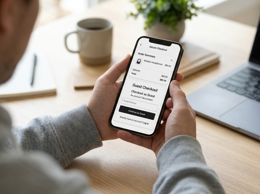
- Offer guest checkout, with account creation offered after the purchase, not as a barrier before it.
- Ask only for information the order genuinely needs, and explain any field that might raise a question.
- Show a simple progress indicator so buyers know how many steps remain.
- Reassure at the point of payment with familiar, clearly presented payment options and a short security note.
- Carry the order summary — items, delivery and total — through every step so nothing feels hidden.
Test the checkout the way customers use it: on a phone, one-handed, possibly distracted. If a step feels tedious in testing, it will feel worse in real life.
Speed and Mobile: The Invisible Basics
A slow shop feels broken, whatever it sells. Compress and correctly size images, remove plugins and scripts the site does not need, and check how pages load on an ordinary mobile connection rather than office Wi-Fi. Product and category pages deserve the most attention, because they carry the most images and the most traffic.
Mobile design is not a smaller version of the desktop site; it is the primary version for most shops. Buttons and filters must be easy to tap, text readable without zooming, and the buy button reachable without scrolling past decoration. Design for the phone first, and the desktop version usually becomes cleaner as a result.
Post-Purchase Touches That Bring People Back
The journey does not end at payment. A clear confirmation page and email — what was ordered, what it costs, when it will arrive and how to get help — closes the sale with the same care the rest of the site showed. Uncertainty after paying is what generates anxious emails and chargebacks.
After delivery, a short follow-up asking for a review, suggesting genuinely related products, or simply thanking the customer keeps the relationship warm. These touches cost little, and they turn a single transaction into the start of repeat business.
Underpinning all of this is the platform decision: whether a custom website vs template better fits your catalogue, your growth plans and the experience described above. The right foundation makes every practice on this list easier to keep.
Frequently Asked Questions
Which change makes the biggest difference first?
Start where visitors drop away. For most shops that is the product page and the checkout: clearer product information, honest pricing and a shorter checkout usually improve results before any visual redesign does.
Do I need to offer guest checkout?
In most cases, yes. Forcing account creation before payment adds friction at the worst moment. Offer the account afterwards, when the customer already trusts you and the order is complete.
How important are reviews?
Reviews are one of the strongest trust signals a shop can show, provided they are genuine and easy to find near the product details. Even a small number of honest reviews is more reassuring than none.
Turn Browsers into Buyers
E-commerce design that converts is not a trick or a single feature. It is the accumulation of clear pages, honest information, steady trust signals and a checkout that respects the buyer’s time — the whole journey, designed as one experience. Work through it stage by stage, and each improvement supports the next.
If you would like an online shop designed around how your customers actually buy, Designores can help — explore our web design services to see what a conversion-focused build involves.


2 Comments