Dark Mode UI Design: Should Your Website Offer It?

Dark mode is everywhere. Phones offer it, apps offer it, and plenty of visitors browse in the evening with screens dimmed and darkened. So it is a fair question: should your website offer it too? It came up as one of the web design trends for 2026 for a reason — but a trend is not automatically right for your business.
This article explains what dark mode is, why visitors ask for it, the honest costs, and the rules to follow if it is right for your site.
What Dark Mode Is, and Why Visitors Like It
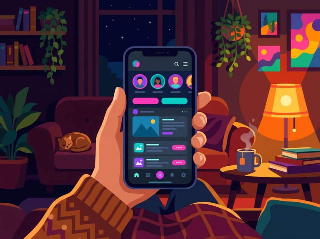
Dark mode swaps the usual light background and dark text for dark backgrounds with light text. Most phones and computers let people choose it as a system-wide preference, and many websites and apps respect that choice automatically.
The appeal is simple. In a dim room, a bright white page feels harsh; a darker screen is easier on the eyes. Some visitors simply prefer it — it can look modern and calm. On OLED phone screens, dark pixels also use less power, so a dark interface can be a little kinder to the battery during evening browsing.
The Honest Drawbacks
Dark mode is not free, and not a one-click feature on a typical website.
It doubles some of the design and testing work. Every page, button, form and message needs checking in both versions. Colours that look rich on white can vibrate or disappear on dark, and fixes must be tested twice.
Images and logos can cause trouble. A logo designed for white, or a photo with bright edges, can look odd or boxed-in on a dark page. These take extra preparation; ignore them and the dark version feels like an afterthought.
Long reading passages are not for everyone. Some readers find light text on dark harder going over long stretches, particularly smaller text. If your site relies on detailed articles, guides or specifications, that matters.
Design Rules If You Decide to Offer It
If you go ahead, dark mode deserves the same care as your main design — not a quick colour swap.
Avoid pure black backgrounds. A very dark grey is softer on the eyes, stops text seeming to glow or blur, and allows subtle shadows and layers that pure black cannot show.
Keep contrast strong. Light text on dark must be easy to read for everyone, including those with weaker vision. If a sentence looks faint or elegant-but-vague, it is not finished. This follows the same thinking as colour and contrast in UI design generally: beauty never excuses hard work for the reader.
Desaturate your colours slightly. Vivid accent colours that shine on white can glare on dark. Softening them a touch keeps buttons and highlights clear without shouting.
Test your logos, images and forms. Check every asset, photo, icon and input field in the dark version. Forms deserve particular attention: faint borders and pale placeholder text are common dark mode failures.
Respect the visitor’s setting, and let them switch. Follow the device preference by default, but always provide an obvious toggle.
So, Should Your Website Offer Dark Mode?
For most small business websites, dark mode is a nice extra, not a necessity. If visitors browse in the evening or read long content on your site, it can make the experience noticeably more comfortable.

But it should never come before the fundamentals. Clear navigation, readable text, fast pages and obvious calls to action earn you enquiries; dark mode earns you goodwill. Get the core right first; add dark mode only when you can do it properly, rather than shipping a half-tested version that is harder to read.
Frequently Asked Questions
Does dark mode save battery on every phone?
No. The saving mainly applies to OLED screens, where dark pixels use less power. On other screens the difference is negligible, so treat battery life as a bonus, not the main reason.
Will dark mode change how my site ranks in search results?
Not directly. Search engines judge content and quality, not colour schemes. What matters is that both versions are equally readable, fast and easy to use.
Can I just invert my website’s colours?
Please do not. Simple inversion produces glaring colours, strange-looking photos and logos, and often poor contrast. A dark version needs its own palette, tested page by page.
Should dark mode be the default on my site?
For most businesses, no. The safest approach is to follow the visitor’s device preference, keep your light design as the standard, and offer a clear toggle.
Key Takeaways
- Dark mode swaps light backgrounds for dark ones, for comfort in low light and personal preference.
- It can be kinder to battery life on OLED phone screens, but that is a bonus, not the point.
- Expect extra design and testing work; watch logos, images and long reading passages.
- Use dark grey rather than pure black, keep contrast strong, and soften your accent colours.
- Respect the visitor’s device setting and always offer a clear toggle.
- Fix your core clarity first — dark mode is a finishing touch, not a foundation.
Thinking About a Dark Mode Refresh?
If your audience browses after dark and you want a dark version as polished as your main site, we would be glad to help you weigh it up and design it properly. Have a look at our web design service to see our approach to thoughtful, visitor-friendly design.