Small Business Website Design Checklist: Avoid These Common Pitfalls

A small business website has a simple job: turn visitors into enquiries, bookings and sales. Yet many sites quietly work against their owners. Pages load slowly, contact details are buried, and the one button that matters is nowhere to be found. None of these problems requires a big budget to fix — most of them just need a careful check before launch, and at regular intervals afterwards.
This website design checklist walks through the essentials in the order a visitor experiences them. Work through it before your site goes live, and again whenever you make a significant change. Each item is a common pitfall we see small businesses fall into, paired with the simple fix that avoids it.
Start With the Foundations
Before you look at colours and layouts, make sure the groundwork is solid. A beautiful site built on shaky foundations will cause headaches later.
- Domain name secured. Your domain should match your business name as closely as possible, be easy to spell, and be set to renew automatically so you never lose it by accident.
- Reliable hosting in place. Choose hosting that keeps your site online and loading quickly. Cheap hosting that goes down or crawls along costs more in lost enquiries than it saves.
- Secure connection (HTTPS). Your site should show the padlock in the browser. Visitors trust it, browsers warn against sites without it, and search engines expect it.
- A clear decision on how the site is built. Weigh up whether a template or a bespoke build suits your budget and plans before you start, because switching later means rebuilding.
Make It Work on Every Screen
Most of your visitors will find you on a phone, often while they are out and about. If the site is hard to use on a small screen, those visitors simply leave and try a competitor instead.
- Fully responsive layout. Text, images and buttons should rearrange themselves neatly on phones, tablets and desktop screens, with nothing cut off or overlapping.
- Readable text without zooming. Body text should be large enough to read comfortably on a phone. If visitors have to pinch and zoom, the design has failed them.
- Tap-friendly buttons and links. Buttons and menu items need enough space around them for a thumb. Tiny links packed tightly together cause frustrating mis-taps.
- Tested on real devices. Check the site on your own phone and ask a friend to try theirs. Emulators help, but real hands find real problems. Building with mobile-friendly, responsive design from the start is far easier than patching a desktop site afterwards.

Say What You Do, Immediately
A visitor should understand what your business does, who it helps and where it operates within seconds of landing on your homepage. If they have to hunt for that information, many will not bother.
- A headline that states your offer. Your main headline should describe the service and the benefit, not just your business name or a vague slogan.
- Your location and service area shown clearly. If you serve a particular town or region, say so on the homepage. Local customers want to know you are local.
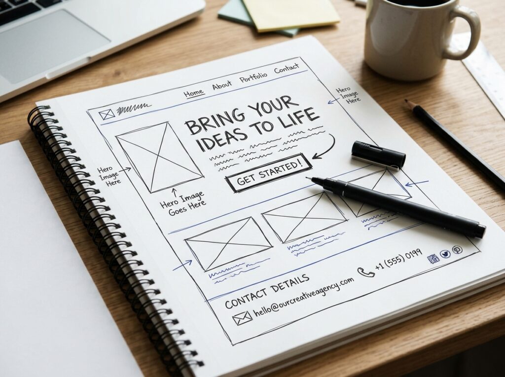
- One obvious next step. Decide the main action you want visitors to take — call, book, request a quote — and make that the most prominent element on the page.
- Honest, current content. Opening hours, service lists and any prices you show must match reality. A visitor who finds different information when they arrive loses trust quickly, and an out-of-date page suggests a business that has stopped paying attention to the details customers care about.
Calls to Action and Contact Details
This is where websites most often lose business. A visitor who is ready to get in touch should never have to work for it. None of this requires clever design — it requires respecting the visitor’s impatience. Assume they are busy, slightly distracted, and one small frustration away from trying a competitor instead.
- A call to action on every page. Every page should end with a clear invitation: phone us, send an enquiry, book an appointment. Do not leave visitors at a dead end.
- Contact details on every page too. Your phone number and email address belong in the header or footer of the whole site, not only on a contact page.
- A short enquiry form. Ask only for what you genuinely need — name, contact details and a brief message. Every extra field puts some people off completing it.
- Forms tested end to end. Send yourself a test enquiry and confirm it arrives in the right inbox. A broken form can quietly swallow enquiries for months.
Speed, Trust and Search Basics
Three quieter areas decide whether visitors stay, believe you and find you in the first place.
- Pages that load promptly. Compress large images, remove plugins you do not use, and test your loading times on a mobile connection, not just office Wi-Fi.
- Trust signals in view. Genuine reviews, accreditations, photos of your team or premises, and clear pricing guidance all reassure a visitor who has never heard of you.
- Sensible page titles and descriptions. Each page needs its own title and a short description that tells searchers what the page offers, written for people first.
- Working links throughout. Click every menu item, button and link. Dead links look careless and strand visitors mid-journey.
Before You Launch: The Final Pass
Set aside an hour for a final check with fresh eyes — ideally someone who did not build the site.
- Proofread everything. Spelling mistakes and out-of-date details undermine the professional image the site exists to create.
- Check in more than one browser. Open the site in at least two different browsers and on a tablet as well as a phone and a desktop.
- Confirm the basics are connected. Analytics, your Google Business Profile and any booking or payment tools should all be linked and working.
- Plan the upkeep. Decide who updates the site, how often content is reviewed, and how backups are handled, so the site stays accurate after launch day.
- A plan for out-of-hours enquiries. Decide what happens when someone writes in during the evening or at a weekend. A simple automatic acknowledgement, with a realistic promise of when you will reply, stops good leads drifting away while your office is closed.

Frequently Asked Questions
How often should I run through this checklist?
At launch, after any major change, and at least once a year. Businesses evolve — new services, new phone numbers, new team members — and websites drift out of date quietly.
What is the single most common pitfall?
Making contact hard work. Buried phone numbers, long forms and missing calls to action lose more enquiries than any design trend ever will.
Can I work through the checklist on an existing site?
Absolutely. Most items are quick fixes on a live site, and working through them is often the clearest way to decide whether you need small improvements or a fuller redesign.
Work Through the List, Then Get a Second Pair of Eyes
A methodical pass through this checklist will catch the pitfalls that cost small businesses enquiries every week. If you would like an experienced team to review your site against it — or to design a new one that ticks every box from day one — take a look at our web design services and get in touch for a friendly, no-obligation chat.