Case Study: Redesigning a Website for Better User Engagement

Every redesign starts with the same frustration: the website exists, the business is good, yet visitors arrive and leave without getting in touch. This case study walks through how a redesign tackled that problem — what was wrong, what changed, and what other small businesses can learn from it.
One important note before we begin: this is an illustrative composite example. It is drawn from the patterns we see across typical small business redesign projects, rather than describing one real client. The business below is fictional, and the results are described in general terms, because the lessons matter more than any single set of figures.
The Business and Its Old Website
Our composite business is a small home-services company — a family-run firm offering plumbing, heating and general repairs across its local area. It relied on word of mouth and repeat customers, and its website was built years earlier as little more than an online business card.
The old site had grown untidy over time. The homepage opened with a long paragraph about the company’s history. Services were listed on one dense page with no individual detail. On a phone, the text was tiny and the phone number was not clickable, so a customer with a burst pipe had to memorise the number or copy it into their dialler. The enquiry form asked for a long list of details, and many visitors started it and gave up partway through.
The owners knew the site was tired, but the turning point was simpler: they realised they could not remember the last enquiry it had produced.
What the Redesign Changed
The redesign kept the company’s name, colours and friendly tone. What changed was the structure, the layout and the order in which information was presented.
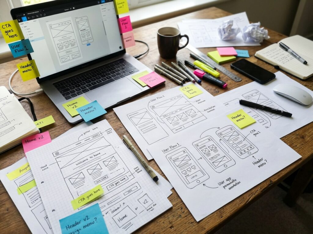
A homepage that answers the visitor’s questions first. The new homepage leads with a plain statement of what the company does and the area it covers, followed by the most requested services. The company’s story still has a place — further down the page, where it belongs.
Individual service pages. Each main service now has its own page explaining what the job involves, what affects the price, and how booking works. Visitors land on the exact page they need, and the pages also give search engines clearer content to rank, which is where SEO-friendly design quietly earns its keep.
A phone-first layout. The redesign was built for the way customers actually arrive: on a mobile, often in a hurry. The phone number sits in a fixed header and can be tapped to call. Text is comfortably readable, and buttons are large enough for a thumb.
A much shorter enquiry form. The form now asks for a name, a phone number, and a brief description of the problem. Everything else can be covered in the follow-up call. Fewer fields meant fewer reasons to abandon the form halfway.
Trust content given proper space. Genuine customer reviews, photos of the team and their vans, and the company’s accreditations were brought out of a forgotten corner and placed where a nervous first-time customer would look for them.

What Happened Afterwards
In the months after launch, the owners reported a clear change in how the website performed for them. Enquiries through the site became a regular occurrence again rather than a rarity, and more of those enquiries came through the tap-to-call button on phones. Visitors were spending longer on the site, reading service pages before getting in touch — which meant the calls they did make were better informed and easier to convert into booked jobs. Fewer people abandoned the enquiry form partway through, and the owners could finally see, page by page, which services people were looking at.
Just as importantly, the team felt proud to send people to the site. It matched the standard of the work they did in customers’ homes — something the old site had never managed. They also stopped apologising for the website when networking, a small thing that changed how confidently they promoted the business.
Lessons for Your Own Redesign
The specifics belong to this composite example, but the principles apply to almost any small business site.
Start with the visitor’s task, not your history. People arrive with a job to do: find a service, check you are credible, get in touch. Design the pages in that order.
Treat the phone layout as the main design. For most local businesses, the mobile version is the website as far as customers are concerned. The desktop version is the bonus.
Shorten every form. Each field you remove is one less reason for a visitor to give up. Collect the essentials and gather the rest in conversation.
Give every key service its own page. It helps visitors, it helps search engines, and it gives you something specific to share and advertise. The same principle underpins good e-commerce web design, where each product category needs room to sell itself properly.
Measure before and after. Even simple analytics show which pages people read and where they leave. Without them, a redesign is guesswork; with them, the next improvement is obvious.

Frequently Asked Questions
Does every business need a full redesign?
No. Sometimes clearer calls to action, a shorter form and a proper mobile layout achieve most of the gain. A redesign earns its cost when the structure itself is the problem, as it was here. A short audit against the points raised in this case study usually reveals which of the two your site needs.
How long does a redesign like this take?
For a small business site of this size, the work is typically a matter of weeks rather than months, depending on how quickly content and feedback come together.
Will a redesign disturb our search rankings?
Handled carefully, no. Keeping the same page addresses where possible, redirecting any that change, and carrying over the content search engines already value protects your position while the design improves.
Thinking About Your Own Redesign?
If your website looks the part but quietly fails to produce enquiries, the problem is usually fixable — and it usually starts with structure, not decoration. Take a look at our web design services to see how we approach a redesign, and get in touch for a friendly conversation about what your site could do better.