Landing Page Design Tips to Boost Your Conversions

A landing page has one job: turn a visitor who arrived from an advert, a search result or an email into an enquiry, a sign-up or a sale. Unlike a normal web page, it is not there to be browsed. Every element on it should either help the visitor decide or get out of the way. That focus is what makes landing pages so effective — and why small design decisions on them matter so much.
The tips below are practical rather than theoretical. None of them requires a big budget. Most are about clarity: saying the right thing, in the right order, with nothing else competing for the visitor’s attention.
Start With One Goal
Before design comes a decision: what single action should this page produce? A quote request, a booking, a download, a purchase — pick one. Every choice that follows, from the headline to the button, serves that goal. Pages that try to do three things at once usually end up doing none of them well, because the visitor is asked to choose before they have been persuaded.
If you run several campaigns, give each one its own page rather than sending everyone to the same place. A page written for one audience and one offer will always feel more relevant than a general page, and relevance is what keeps people reading instead of bouncing away.
Write a Headline That Matches the Promise
Your headline has only seconds to convince a visitor that they are in the right place. It should state plainly what you offer and who it is for, and it should match the advert or link that brought the visitor to you — if the ad promised one thing and the page talks about another, people leave. A short supporting line underneath can add the useful detail: how it works, how quickly, or what makes it different.
Avoid cleverness for its own sake. A headline a visitor has to decode is a headline that loses people. Test yours by asking whether someone who knows nothing about your business could say, after five seconds on the page, what is being offered and what they are supposed to do next.

Remove Everything That Does Not Help
A homepage needs navigation; a landing page mostly does not. Menus, sidebars, extra links and unrelated offers all give the visitor an exit that is not your call to action. This is why many landing pages use a stripped-back layout: the logo at the top, the message, the proof, the form or button — and very little else.
Apply the same discipline to the content itself. Every paragraph should either answer an objection or add a reason to act. If a section does neither, cut it. Shorter pages are not automatically better, but every element on the page should have to earn its place there.

Make the Call to Action Impossible to Miss
The call to action is the whole point of the page, so design it like it matters. Use a button that stands out clearly from everything around it, sized generously for thumbs on a mobile screen, with text that says what happens next — wording like “Get my free quote” is more persuasive than a bare “Submit”. Repeat the button at natural points down the page, so a convinced visitor never has to scroll back up to find it.
Keep the ask proportionate, too. Asking for a name and an email address is reasonable for a guide or a callback; asking for a full project history before you have given anything back is not. The shorter and simpler the form, the more people will complete it — so only ask for what you genuinely need at this stage.

Add Proof Near the Point of Decision
Visitors hesitate most just before they act, so place your reassurance at exactly that point. Genuine testimonials, recognisable client names, accreditations and clear guarantees all help — as long as they are real and specific. If your landing page supports an online shop, the same thinking applies at a larger scale, and our guide to e-commerce web design best practices covers how product and checkout pages earn a customer’s trust.
Answer the obvious questions on the page itself: price guidance where you can honestly give it, timescales, and what happens after someone enquires. Every unanswered question is a reason for the visitor to postpone — and postponed usually means lost.
Design for Mobile, and Keep It Fast
A large share of landing page visits happen on phones, often straight from a social media advert. The page must load quickly and read comfortably on a small screen: headline first, benefits in short chunks, the button always within easy reach. Test the page on a real phone over a mobile connection, not just on fast office Wi-Fi.
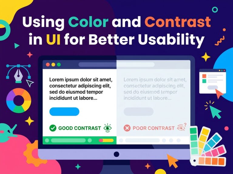
Accessibility matters here as well. Following an accessible web design approach — readable contrast, properly labelled form fields, buttons that work by keyboard as well as by touch — makes the page usable for more of the people your campaign reaches, and removes friction for everyone else too.
Frequently Asked Questions
How long should a landing page be?
As long as it needs to be to answer the visitor’s questions — and no longer. A simple offer may need only a few short sections; a considered purchase may need more detail, proof and answers before someone is ready to act.
Should every campaign have its own landing page?
Ideally, yes. A page matched to one audience and one message feels relevant in a way that a general page never can, and you can adjust or retire it without touching the rest of your website.
What is the biggest landing page mistake?
Sending campaign traffic to a homepage. A homepage offers many paths and no particular focus; a landing page offers one clear next step, which is exactly what a campaign needs.
One Page, One Decision
A good landing page is not about tricks or pressure — it is about making one decision easy for the visitor. If you would like a landing page designed around your offer, or your existing pages reviewed and sharpened, our web design services include pages built to convert from the first headline to the final button. Talk to Designores and tell us what you are promoting.