
Case Study: Transforming a Logo to Boost Brand Engagement
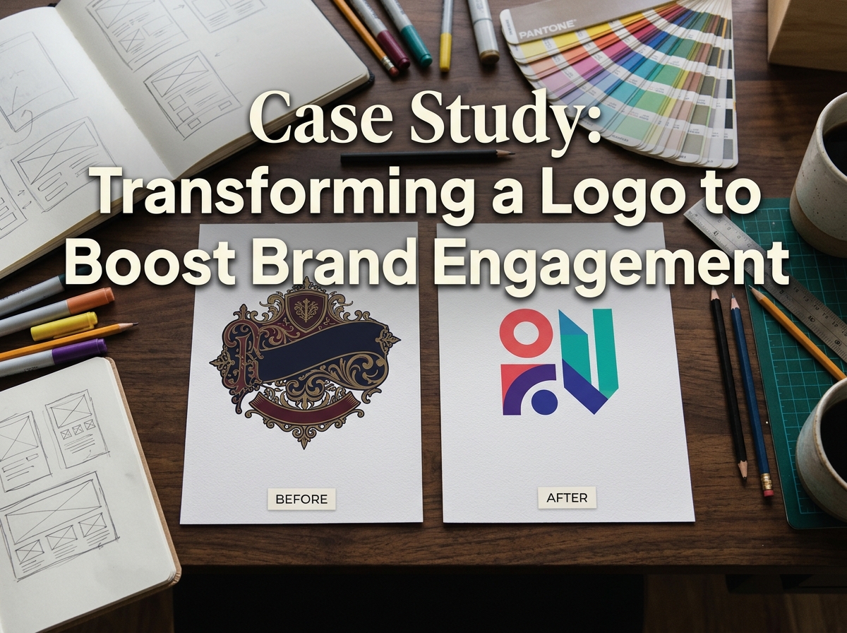
A logo can be loved and still be holding a business back. This case study follows a representative example — a family-run bakery and café chain we’ll call The Corner Crumb — through a careful logo redesign: what was wrong, what changed, and what you can learn from it.
The Corner Crumb’s original logo had served for over a decade. Customers recognised it, staff were fond of it — but it was quietly failing at modern jobs. It looked dated next to newer competitors, its fine details vanished at small sizes, it broke down as a social media avatar or app icon, and slightly different versions were in use across its shops. What it needed was professional logo design, not a new identity.
The Starting Point: The Old Logo and Its Problems
The old mark was an illustration: a hand-drawn wheat sheaf wrapped around the bakery’s name in script typeface, finished with a border. Charming at the size of a shop sign — troublesome almost everywhere else.
- Too busy. Fine lines and small elements competed for attention; the eye didn’t know where to land.
- Thin strokes. Hairline strokes in the script lettering and wheat details filled in when printed small and disappeared on screens.
- Too many colours. Five colours plus gradients made reproduction expensive and inconsistent — each printer and platform rendered it differently.
- No responsive versions. One logo file, designed for signage. Staff cropped, stretched and recoloured it for menus, packaging and social profiles — creating the inconsistency.

The fault wasn’t the original designer’s: the logo was made for a print-first world the business had outgrown.
The Redesign Process
Step 1: Audit before drawing. Every use of the old logo was collected — signage, packaging, menus, uniforms, the website, social profiles — alongside competitor marks. The audit confirmed the problems and showed what customers recognised.
Step 2: Agree what must be preserved. Three assets were non-negotiable: the name, the wheat motif (tied to the bakery’s craft), and the warm, golden colour family. Everything else was open to change. Agreeing this up front is what separates a refresh from a rebrand: the equity stays, the problems go.
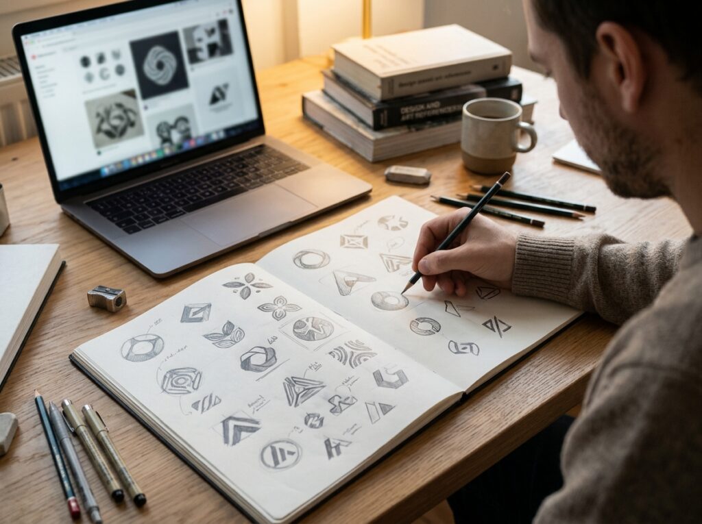
Step 3: Sketches to vector. Dozens of pencil directions explored how simply the wheat could be drawn and still read as wheat. The strongest routes were rebuilt as clean vector artwork, tested at the failing sizes: a social avatar, a loyalty-card stamp, a delivery-app listing.
Step 4: Stakeholder testing. Shortlisted versions were shown to staff and regular customers — not to vote on taste, but to check recognition: shown the new mark briefly, could they name the business? The winning direction kept recognition highest while fixing the technical problems.
A logo never works alone — it anchors the wider brand identity, so signage, packaging and digital templates were planned alongside it.
Related post: rebranding
What Changed and Why
- A simplified mark. The wheat sheaf was redrawn as a bold, geometric motif of a few confident shapes — it now survives at 16 pixels and at shopfront size alike.
- Bolder letterforms. The fragile script was replaced with warm, sturdy lettering with generous spacing — readable across a street and on a phone screen.
- A reduced palette. Five colours became two: a deep warm brown and a golden wheat tone, plus cream for backgrounds. Cheaper to print, impossible to render “wrong”.
- A responsive logo suite. Instead of one file: a primary logo, a stacked version for square spaces, and a standalone wheat icon for avatars and favicons — with clear-space and minimum-size rules, so nobody improvises again.
The Rollout
The new identity was phased in over a few months rather than swapped overnight. Digital touchpoints changed first — social avatars, the website, email templates — because they are free to update and reach customers daily. Packaging followed as stock ran out; signage was replaced location by location during planned maintenance.
Phasing protected recognition: customers met the new mark gradually, in familiar places, alongside the same name, colours and people. Keeping the presentation consistent at every step turned a new logo into a familiar one quickly.

The Results
In the months after the rollout, the business reported just the changes a refresh is meant to produce. The mark was finally recognisable at small sizes — customers could pick the bakery out in a delivery app list or a social feed. Every location used the same artwork, ending the drift between versions. Social posts carrying the new branding drew noticeably more engagement, which the owners credited to sharper, more consistent-looking posts. Staff described the new look as “still us, just tidier”, and regulars recognised the shops immediately — exactly the outcome the process was designed to protect.
Key Takeaways for Your Own Logo Refresh
- Preserve the equity. Identify what customers recognise — a motif, a colour, a name style — and carry it forward.
- Design for the smallest use first. If a mark works as an avatar and app icon, it works anywhere; the reverse is rarely true.
- Build a suite, not a single file. Primary, stacked and icon versions stop staff improvising their own.
- Reduce the palette. Fewer colours means cheaper, more consistent reproduction.
- Phase the rollout. Digital first, print as stock runs out, signage on schedule — recognition survives the change.
- Get guidelines. Clear-space, minimum sizes and usage rules keep the new logo new.
Frequently Asked Questions
Will a redesign confuse my existing customers?
Not if it’s handled as a refresh rather than a replacement. Keeping the name, a recognisable motif and the core colours means customers register “sharper” rather than “different”.
How much change is too much?
Too much is when the recognition assets disappear: a new name style, new colours and a new symbol together ask customers to learn a new brand. Change the execution freely; change the identity anchors cautiously.
How long does a logo refresh take?
The design work itself is usually a matter of weeks once the audit is done. The rollout takes longer — plan it around stock and maintenance schedules, not a single switch-over date.
Do I need to rebrand everything at once?
No — and you shouldn’t. A phased replacement protects recognition and spreads cost. Prioritise the touchpoints customers see most — digital, packaging, signage.
Conclusion: Refresh the Logo, Keep the Brand
The Corner Crumb didn’t need a new brand — it needed its logo rebuilt for modern sizes, screens and channels. Simplify the mark, keep what customers recognise, deliver a proper suite, roll it out gradually: the pattern behind almost every successful refresh.
Thinking your own logo is due the same treatment? Designores handles logo redesign with this care — 1,600+ projects for 900+ companies, from single refreshes to complete brand identities. Get in touch for an honest audit of what you’ve got.





3 Comments