
How to Choose the Best Typography for Your Brand Logo
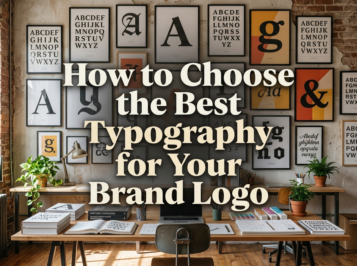
Imagine your business name set in two typefaces: a formal serif with fine, elegant strokes, and a chunky rounded sans-serif. Same words — but the first suggests a solicitor’s office and the second a children’s toy shop. The letterforms in your logo speak before anyone reads a word, setting expectations about price, personality and professionalism. Choosing them is a branding decision, not a decorative afterthought — and one of the most consequential choices in any logo design project.
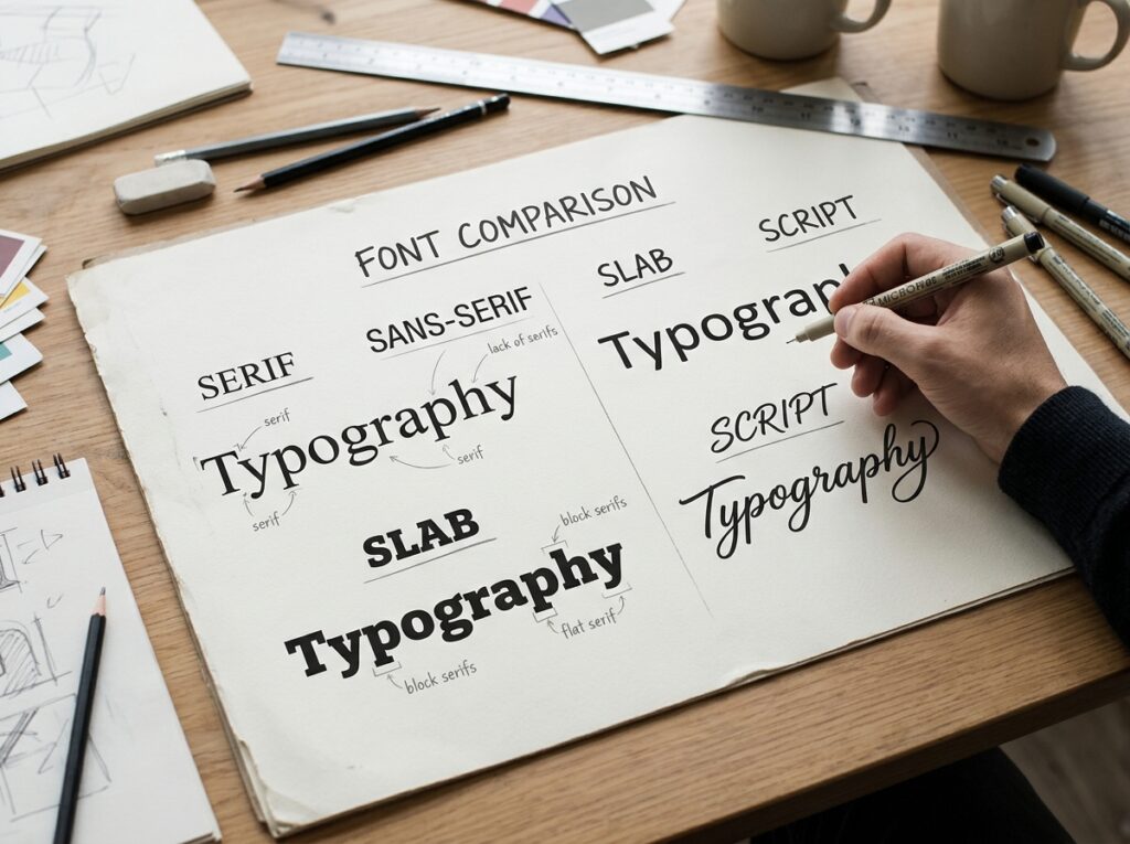
The Main Typeface Families and What They Say
Each typeface family carries associations built up over decades of use — knowing them turns an endless scroll into a shortlist with intent.
Serif. Letters with small finishing strokes (feet) on their ends. Serifs signal tradition, trust, craft and authority — think law, finance, publishing and premium products. The risk: fine serifs can clog or disappear at small sizes.
Sans-serif. Letters without those strokes — clean, open and direct. Sans-serifs feel modern, honest and approachable, and are favoured by technology, start-up and service brands. The risk: generic ones feel anonymous, so proportions, spacing and weight matter.
Slab serif. Serifs thickened into bold blocks. Sturdy, confident and a little industrial, slab serifs suit trades, outdoor and food brands wanting weight without formality, and hold up well at a distance.
Script. Letterforms imitating handwriting or calligraphy. Scripts feel personal, elegant or playful — suited to boutiques, beauty and hospitality. They are also the riskiest family: flourishes that charm on a shopfront may be unreadable on a business card.
Display and decorative. Typefaces designed to grab attention. They carry huge personality, but date quickly and lack the refinements of workhorse families. Use only where character matters more than versatility.
Match Type to Your Brand Personality
Before opening a font library, write down three words for your brand’s personality — calm, expert, warm, say, or bold, playful, affordable. Set your name in each candidate and judge it against those words, not personal taste: a font you merely like is not the same as one that says the right thing.
Then check the fit with audience and market. Customers arrive with expectations — a funeral director set in a comic display face would unsettle people, however well drawn. Study respected competitors: sit comfortably in their world, but remain distinguishable from all of them.
Readability Rules That Matter
A logo that cannot be read is a logo that cannot work. These rules are non-negotiable:
- Small sizes. Your logo will appear tiny — favicons, app icons, embroidery. Set it 15mm wide and check it still reads.
- Distance. Signage is read from across a street. Heavy, open letterforms survive; delicate ones vanish.
- Letter spacing. Cramped letters merge; over-spaced letters fall apart. Spacing should feel even.
- Thin strokes. Hairline strokes break up in print, foil, engraving and single-colour work.
- All-caps behaviour. Capitals change a word’s shape and spacing — check your name fully capitalised, as signage and stamps often use caps.
- One colour. If the letters only work in a gradient or full colour, they do not work. Test in solid black.
Practical Checks Before You Decide
- Print it tiny and huge. Business-card size and poster size expose weak letterforms faster than any screen zoom.
- One-colour test. Black on white, then reversed white on black. Both must stay crisp.
- Arm’s-length test. Tape it to a wall and read it from across the room — how signage is actually seen.
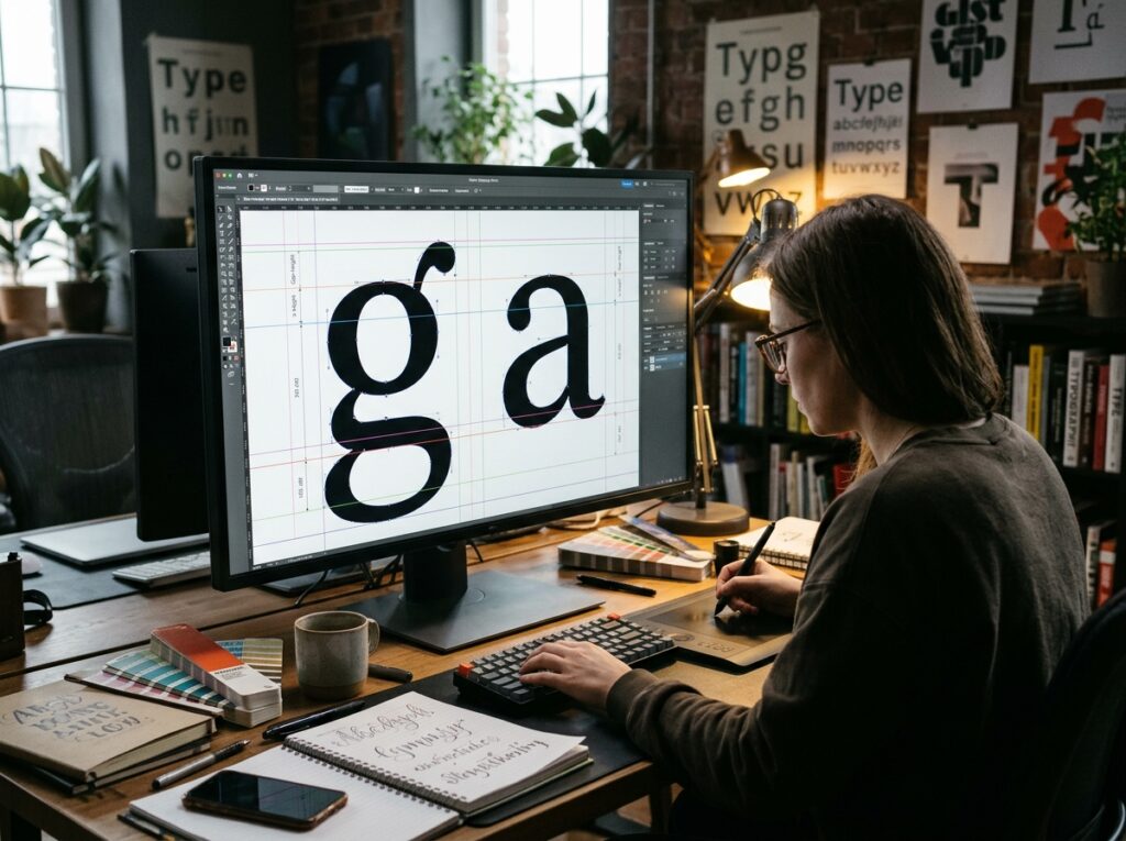
- Check every letter of your name. Only the letters you use matter. Look for awkward shapes, unfortunate joins and uneven kerning (pairs like “Av” or “To” often need adjustment).
- Licensing. Confirm the licence permits logo and trademark use, and file it with your brand documents.
Pairing and System Thinking
Your logo typeface does not live alone. It sits inside a wider brand identity alongside heading and body fonts on your website, documents and social posts — the whole system should feel like one family with clear roles:
- Limit the count. Two typefaces across the brand is usually plenty; three is a ceiling, not a target.
- Complement, don’t compete. Pair different families rather than two similar faces fighting.
- Check the weights. Choose families with a useful range — light, regular, bold — for flexibility.
- Be consistent. Using the agreed fonts everywhere, every time, turns a type choice into recognition.
Common Mistakes
- Too many fonts. Three typefaces in one logo is not variety; it is noise.
- Defaulting to the first free font. The most-downloaded free font is already on thousands of other logos.
- Unreadable scripts. If customers must guess your name, the font has failed its only job.
- Ignoring licensing. Learning after launch that your font forbids trademark use means an unbudgeted rebrand.
- Bad letterspacing on capitals. All-caps words need deliberate spacing; default tracking looks strained and amateur.
Quick Checklist
- Three personality words defined before browsing fonts
- Typeface family matches those words and market expectations
- Reads clearly at 15mm and from across a room
- Works in solid black and reversed out
- Every letter of the business name checked, kerning adjusted
- Licence confirmed for logo and trademark use
- Logo type pairs cleanly with heading/body fonts
Frequently Asked Questions
Can I use a free font in my logo?
Often yes — but read the licence. Many free fonts allow commercial use including logos; some restrict trademarking or require attribution. “Free to download” is not “free for everything”.
Should my logo font match my website font?
It can, and using the same family creates instant cohesion. But it is not required: many brands pair a distinctive logo face with a more practical, legible family for headings and body text.
Custom lettering or an existing font?
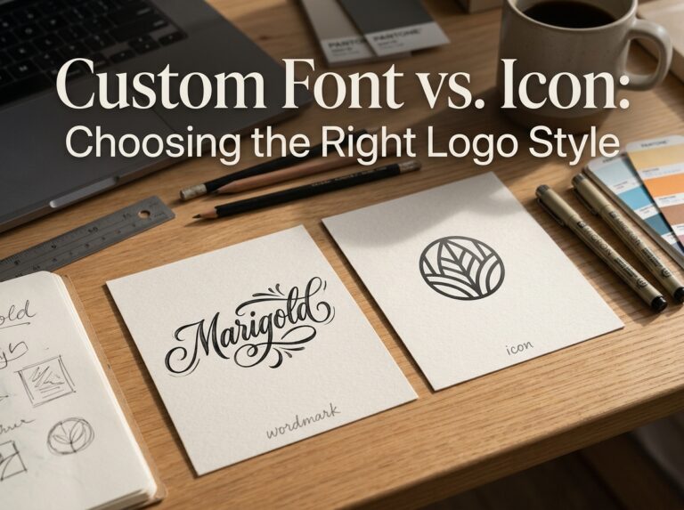
An existing font is faster, cheaper and battle-tested. Custom lettering gives you something no competitor can download, but costs more. Many strong logos start from an existing font, then modify key letterforms to make it their own.
How many fonts should a logo contain?
One, almost always. A tagline may use a second, quieter face, but the name itself should speak in a single voice. If a design needs two competing typefaces to feel interesting, the concept is the problem.

Conclusion: Type Is the Voice — Choose It Deliberately
The best logo typography is not the prettiest font in the library; it is the one that says your three personality words at a glance, reads at every size from favicon to fascia, survives one-colour reproduction, and is licensed for the job. Filter by personality and test ruthlessly — your name will sound like your business before a word is read.
Typography is part of every logo and brand identity project at Designores, where the studio has completed 1,600+ projects for 900+ companies. If you would like your type chosen with this much care, get in touch.




One Comment