Minimalist Branding: When Less is More for Your Business

The brands customers remember most are rarely the busiest. A simple mark, one or two colours, a name set cleanly — these are recognised in a fraction of a second and remembered long after busier designs blur together. That is the appeal of minimalist branding: not an empty look, but an edited one, where everything that remains has earned its place. For a small business competing for a few seconds of attention, that clarity is a genuine advantage. This guide explains what minimalist branding is, why it works, what to remove, what to protect — and when minimalism is the wrong choice altogether.
What Minimalist Branding Actually Is
Minimalist branding is a brand identity built from the fewest elements that can do the job properly: a simple logo, a limited colour palette, one or two typefaces, generous space around everything, and plain, direct language. Nothing is there by accident, and nothing decorative survives unless it also communicates. It helps to think of it as editing rather than absence. A cluttered identity tries to say five things at once and ends up saying none of them clearly; a minimal one makes a single point, confidently. The goal is still a complete brand identity — logo, colours, type and tone — just with every element chosen deliberately and the rest removed.
Why Less Works
Minimalism is popular because it performs, not just because it looks modern. Four benefits explain most of its appeal:
- Clarity. A simple identity is understood at a glance. Customers grasp what you are and whether you are for them in seconds — before they have read a word.
- Trust. A tidy, controlled presentation suggests an organised business. Customers cannot see your systems, so they judge the care they can see — and careful design reads as careful service.
- Versatility. Simple marks survive every format: a tiny app icon, embroidery on a uniform, a one-colour invoice, a large shop sign. Complex logos quietly break in at least one of those.
- Timelessness. With fewer trend-driven details, there is less to date. Minimal identities tend to need refreshing rather than replacing, which protects the recognition you have built.

What to Strip Away — and What to Keep
Start with what usually goes. Extra colours are the most common clutter: many small brands accumulate five or six, none used consistently. Decorative effects — shadows, gradients, outlines — often add noise without meaning. Multiple typefaces, long taglines repeated on everything, and generic stock imagery that could belong to any business all dilute recognition.
What stays is the core: your name, set clearly; one colour used so consistently it becomes yours; and the single idea your brand stands for. Colour deserves care here, because with a short palette each shade carries more weight — a basic grasp of colour psychology helps you choose shades whose associations match the feeling you want.
When Minimalism Is the Wrong Choice
Minimalism is a tool, not a virtue, and some brands should not use it. Businesses that trade on warmth, abundance, heritage or spectacle — a vintage emporium, a festival caterer, a children’s party company — may need richness and detail to feel right. Strip those back and you remove the very thing customers loved.
The subtler risk is anonymity. Taken too far, minimalism produces a plain wordmark in a safe typeface that could belong to anyone. A minimal brand still needs one distinctive feature — an unusual letterform, a signature colour, a confident shape — and in practice that feature usually lives in the logo, the element customers see most. If removing something removes your personality, that something was the brand.
How to Simplify Your Brand in Practice
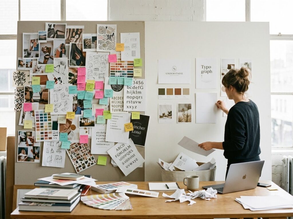
Audit before you cut. Gather your logo files, website, packaging, social profiles and printed materials in one place. List every colour, typeface and graphic device actually in use — the gap between what you think your brand is and what is really out there is usually the problem.
Remove one element at a time. Delete the second typeface, then the spare colours, then the decorative extras, checking after each step that the materials still feel like you. Gradual removal protects recognition; a sudden overnight change can strand loyal customers.
Test at the smallest size. Shrink your logo to a website favicon (the tiny icon in a browser tab) and a social avatar. Whatever survives that test is your real identity; whatever disappears was decoration.
Quick Checklist
- Logo works at favicon size and in one colour
- Palette cut to one core colour plus supporting shades and neutrals
- No more than two typefaces in use anywhere
- One distinctive feature kept — the thing customers recognise you by
- Decorative elements removed unless they communicate something
- Old materials updated so the simplified brand is consistent everywhere
Frequently Asked Questions
Is minimalist branding only for luxury and technology brands?
No. Those sectors popularised it, but the benefits — clarity, trust, versatility — apply anywhere. A plumbing firm with a clean mark and one strong colour looks more credible than one with a busy, clip-art-heavy van.
Will a very simple logo look cheap or unfinished?
Only if simple is confused with careless. A minimal logo still needs proper craft: balanced proportions, careful spacing and professional files. Simplicity arrived at by editing looks confident; simplicity arrived at by skipping the work looks empty.
How do I simplify without losing existing recognition?
Keep the recognisable core — usually your name, core colour and one distinctive feature — and remove everything around it. Customers should feel the brand became clearer, not different. Evolution, not a restart.
Does minimalist branding mean black and white only?
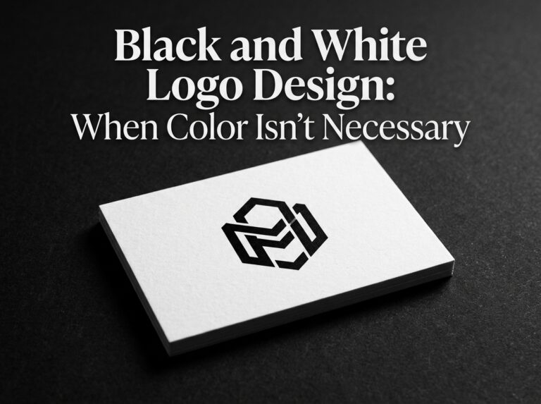
No. It limits the number of elements, not the colour itself. One bold colour used with discipline is thoroughly minimalist; five muted colours used loosely are not.
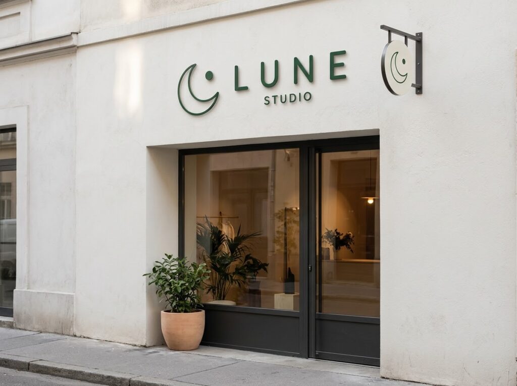
Conclusion: Less, but Better
Minimalist branding works because it respects how people actually meet brands: briefly, distractedly, and quick to judge. A clear, confident identity is understood faster, trusted sooner and remembered longer — provided you keep the one feature that makes it unmistakably yours. Edit hard, but edit around your personality, not through it.
If you would like your brand edited down to what matters, Designores is a full-service design studio that has completed 1,600+ projects for 900+ companies, and can help you simplify without losing what makes you recognisable.