
How Color Psychology Influences Your Brand’s Success
Before anyone reads your name, tagline or prices, they see your colour — on your shopfront, website and packaging — and it quietly shapes how they feel about your business before a single word is read. First impressions form in seconds, and colour plays a major part in them. Choosing brand colours is not a decoration decision; it is a communication decision that strongly influences how customers judge you.
What Is Colour Psychology?
Colour psychology is the study of how colours influence feelings and behaviour. We attach associations to colour quickly and unconsciously: red feels urgent, blue feels calm, green feels natural. Those associations matter because feelings drive decisions — people choose suppliers they feel good about, then justify it with logic. A frequently cited study on colour and marketing found that most snap judgements about a product are influenced by its colour.
Be honest about the limits, though. Colour associations are tendencies, not laws: they vary with culture, context, personal experience and shade — sage green and neon green say very different things. Used well, colour psychology is one part of a complete color psychology branding approach, alongside values, audience and market.
Colour by Colour: What Each Hue Communicates
Red — energy, urgency, appetite
Red signals excitement, confidence and action, and stimulates appetite — hence its popularity with food brands.
Suits: food and drink, entertainment, fitness, sales.
Watch out: in excess it reads as danger, anger or cheap urgency.
Orange — warmth, value, enthusiasm
Friendly and energetic without red’s alarm, orange suggests good value and creativity.
Suits: creative businesses, leisure, children’s brands, budget-friendly services.
Watch out: overused, it looks cheap and undermines a premium offer.
Yellow — optimism, attention, youth
Yellow is the happiest colour and the first the eye notices — excellent for signage.
Suits: children’s products, leisure, food, cheerful visibility.
Watch out: hard to read as text and tiring over large areas; use as an accent.
Green — growth, health, nature
Green means nature, balance, freshness and prosperity.
Suits: organic and eco brands, wellness, gardening, and finance suggesting growth.
Watch out: the wrong shade looks muddy or dated, and green “eco” claims invite scrutiny.
Blue — trust, calm, professionalism
Blue is the most widely trusted brand colour: reliability, competence, calm.
Suits: finance, technology, healthcare, corporate and B2B services.
Watch out: in excess it feels cold and distant — and in some sectors it is too common to distinguish you.
Purple — creativity, quality, luxury
Long linked with royalty, purple suggests premium quality and imagination.
Suits: beauty, creative services, premium and wellness brands.
Watch out: heavy, dark purples can read old-fashioned or overly mystical.
Pink — care, playfulness, warmth
Modern pink goes well beyond old stereotypes: soft and caring, or bold and confident, depending on shade.
Suits: beauty, fashion, bakeries and modern food brands.
Watch out: it divides opinion — test it with your actual audience.
Black — premium, sophistication, power
Black signals luxury, authority and timeless style, and makes other colours look richer.
Suits: luxury goods, fashion, photography, high-end services.
Watch out: it is heavy; overuse feels unwelcoming.
White, grey and neutrals — clean space
White suggests simplicity and honesty; grey adds professionalism; browns bring warmth and craft. Neutrals rarely carry a brand alone, but they give brighter colours room to work.
Warm vs Cool Colours
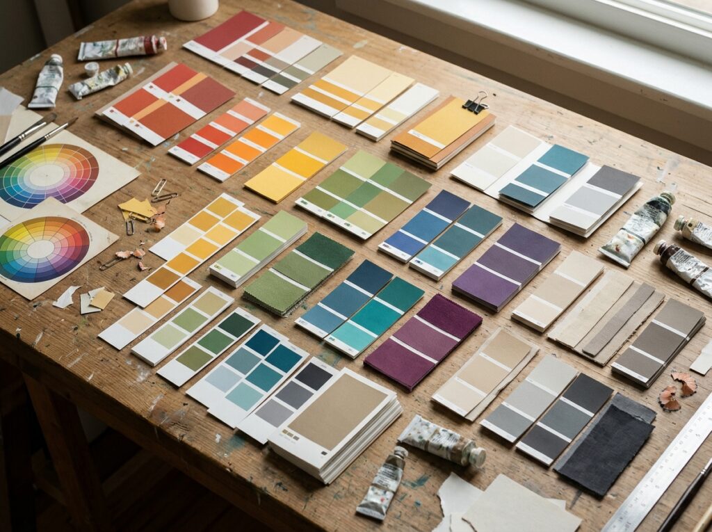
Reds, oranges and yellows are warm colours: they advance towards the viewer, creating energy, appetite and urgency. Blues, greens and purples are cool colours: they recede, creating calm, trust and space. Most strong palettes mix the two — a trustworthy cool base with one warm accent for calls to action.
How Colour Choices Affect Your Brand in Practice
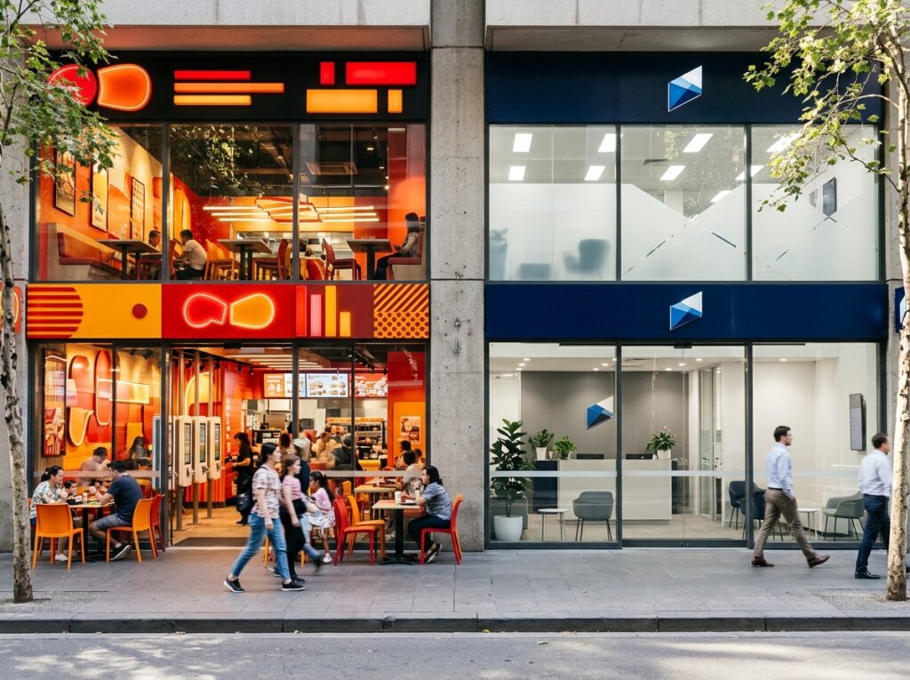
Distinctive colours aid recognition: think how quickly a particular purple chocolate wrapper or red delivery van comes to mind. Colour also differentiates you — if every competitor is blue, teal or orange may win attention, while in a loud market calm colours stand out by contrast.
Just as importantly, colour must fit. A funeral director in playful yellow, or a children’s party company in stark black, creates friction customers feel but cannot explain. And consistency matters: screen colours (RGB) look brighter than print (CMYK), so an unchecked palette can drift until the brand looks inconsistent.
How to Choose a Palette That Fits Your Brand Values
- Start with feelings, not swatches. Write down the three feelings your brand should create — trustworthy and calm, bold and exciting — based on your values and audience.
- Study your category and competitors. Note the colours your sector relies on. Fit those expectations, or deliberately stand out — but make it a choice.
- Build a small palette. One primary colour, one or two supporting colours, and neutrals. Small palettes stay recognisable.
- Pay attention to shades and tints. Personality lives in the exact shade: navy and sky blue are both “blue” but say different things.
- Check contrast and accessibility. Text must stay readable for everyone, including people with colour-vision deficiencies. Never rely on colour alone for important information.
- Test on real items. Put the palette on your logo, a website mockup and a print proof — colours behave differently on paper, packaging and signage.
- Record the codes. Write down the HEX, RGB and CMYK values for every colour, so anyone creating for you reproduces them exactly.
A palette chosen this way becomes part of your wider brand identity, not an isolated taste decision — it carries your values into every leaflet, page and parcel.

Common Mistakes to Avoid
- Choosing personal favourites only. Your favourite colour is a starting point, not a strategy — the palette must speak to customers.
- Copying a competitor’s colours. You will look like a weaker version of them, and invite confusion.
- Using too many colours. Six competing colours say nothing clearly. Restraint makes a palette memorable.
- Ignoring accessibility and print. A palette that fails contrast checks or prints muddy fails in the real world, however good it looks on screen.
- Chasing colour trends over brand fit. Fashionable shades date quickly; a palette rooted in your values can serve for years.
Quick Checklist
- Palette starts from brand values and audience feelings
- Competitor colours checked — fit in or stand out deliberately
- One primary, one or two supporting colours, plus neutrals
- Exact shades chosen, not just colour families
- Contrast and accessibility tested
- Proofed on screen and in print
- Colour codes recorded for everyone to use
Frequently Asked Questions
What is the most trusted brand colour?
Blue, in most Western markets — hence its dominance in banking, tech and healthcare. Trust also depends on shade, design quality and consistency, so blue alone is no shortcut.
Can the wrong colour really hurt sales?
It can hurt the steps before sales: attention, first impressions and whether customers feel a brand is “for them”. A colour that clashes with your offer creates doubt, and doubt loses enquiries — even if the product is excellent.
Should I change my colours if they do not match my values?
Possibly, but move carefully. If your palette contradicts your positioning, evolving towards better-fitting shades beats a sudden overnight change, which can confuse loyal customers. Test new shades digitally first.
Do colour meanings differ by country?
Yes. White is linked with weddings in much of the West but mourning in parts of Asia; red means luck in China but danger elsewhere. If you sell internationally, check your palette against each market’s associations.
Conclusion: Colour Is a Message — Send the Right One
Your colours speak before you do. When they match your values and customers’ feelings, they build recognition and trust every time your brand appears. When they clash, they quietly work against you. Choose deliberately, test in the real world, and record your palette properly.
If you would like colours chosen with strategy behind them, Designores is a full-service design studio that has completed 1,600+ projects for 900+ companies, including brand identities and palettes that help marketing land. Get in touch when you are ready.







2 Comments