
Story of a Logo: How to Redesign Your Brand Mark for 2026
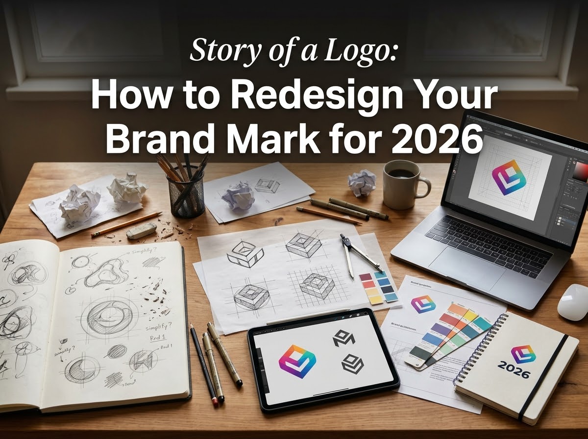
Every logo has a story. It was created for the business as it was then: its customers, its premises, the styles of its time. Years later the business has moved on — new services, a new audience. The mark, though, still tells the old story. Add the demands of 2026 — an app icon, a social avatar and a shopfront sign at once — and the gap is hard to ignore. A redesign closes it. Done well, it is not a break with the past but the next chapter: the same business, told more clearly.
Step 1: Audit the Mark You Have
Gather every version of the logo you can find. Do you hold proper vector files, or only a small image lifted from the website? Where does it appear — signage, vehicles, packaging, invoices, social profiles? How does it behave small, and in a single colour?
Then judge it honestly. What still works — a shape customers recognise, a colour they associate with you? What fails — cramped lettering, dated styling, a symbol that no longer fits what you sell? Recognition is equity already paid for — the audit shows how much of it to protect.
Step 2: Research Before You Sketch
A redesign aimed only at personal taste usually misses. Look outward first. Study competitors’ marks: the colours, styles and symbols your category relies on, and the gap you could own. Look at your audience too: a mark that suited your first customers may not speak to the next ones.
A direction that closely resembles an existing trademark is a dead end, however attractive. The research ends with one sentence: what the new mark needs to say, and to whom. Every later decision gets tested against it.
Step 3: Decide — Evolution or Revolution
Now the biggest choice: how far to go.
- Evolution — keep the recognisable core (the shape, colour or lettering people know) and refine it: cleaner lines, better spacing, a redrawn symbol. Best where recognition is healthy and the mark has simply aged.
- Revolution — replace the mark entirely. Best when the name, offer or audience has fundamentally changed, or the old logo causes real problems: confusion with a competitor, or a design that cannot be trademarked.
Choose on evidence, not boredom. If more than the logo is changing — name, positioning, the whole identity — treat the redesign as part of a wider programme, not a standalone swap.
Step 4: Write the Brief
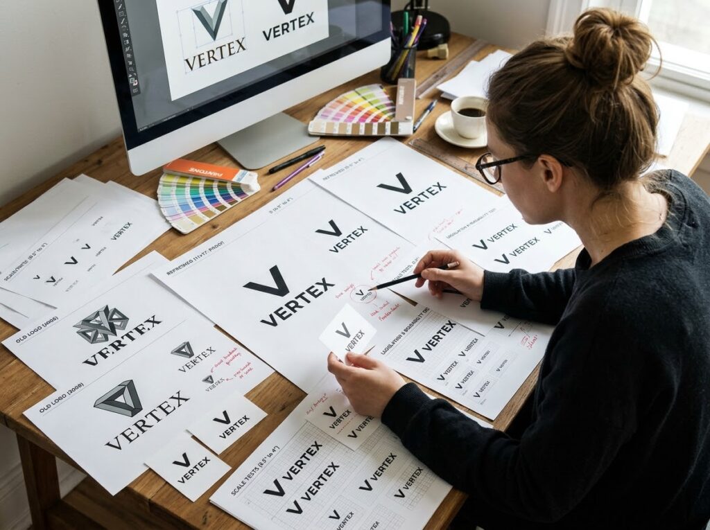
A designer can only hit a target they can see. A short written brief turns research into instructions: the business and its audience, what the redesign must achieve, what must be kept and what must go, where the logo will be used, and the deliverables you expect (primary, stacked and icon versions; colour, black and white; vector and web files). An hour of briefing saves days of misdirected concepts.
Step 5: Explore Concepts, Then Narrow Down
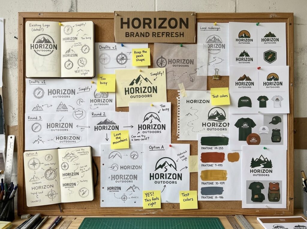
Expect several directions first, not one polished answer. Judge each against the brief, not by gut reaction alone. Does it say what the research said it must? Will customers still recognise you in it — or, for a revolution, is the break deliberate and complete? Resist decoration — the strongest marks are usually the simplest. Shortlist one or two for refinement. Seeing a real logo transformation worked through end to end helps you know what to expect here.
Step 6: Test It Where It Has to Work
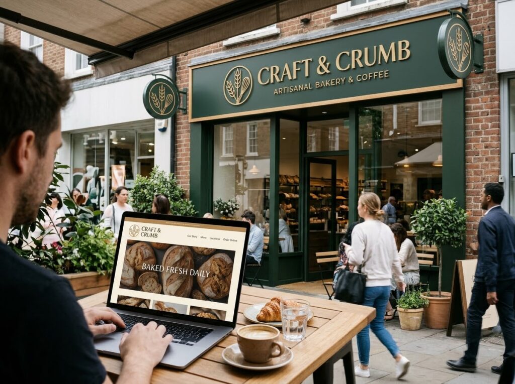
A logo that charms on screen can fail in the real world. Test the finalist at favicon and app-icon size, in plain black, reversed out of a dark background, and in print. Mock it onto your shopfront, packaging and a social avatar. Show it to people who do not know the business and ask what they think it does; if the answers miss, it needs more work. Then live with it a few days before deciding — first reactions settle with time.
Step 7: Roll It Out Like You Mean It
Launch day is a swap, not a trickle. Update the website, social profiles, templates, signage and packaging together, so customers never meet a confusing half-and-half brand. Announce it briefly — a short post explaining the new look lets loyal customers reattach their recognition and turns the redesign into news, not a quiet puzzle. Update your guidelines, and archive the old files. If the refresh also covers your wider logo design and identity materials, change them together so everything matches from day one.
Quick Checklist
- Audit done: files, usages, small-size performance checked
- Strengths of the old mark identified and protected
- Competitors and audience researched before sketching
- Evolution or revolution chosen deliberately
- Written brief covers audience, must-keeps and deliverables
- Finalist tested small, in mono, in print, with real people
- Rollout planned across every touchpoint, guidelines updated
Frequently Asked Questions
How do I know my logo needs a redesign?
The usual signs: it fails at small sizes, it no longer matches what you sell or who you sell to, you lack proper files, or customers mistake you for a competitor. If none apply, it is a want, not a need — recognition already owned beats novelty.
How long does a logo redesign take?
From a couple of weeks for a light evolutionary refresh to a few months for a full replacement with research and testing. The stages most often skipped — research and testing — are the ones that prevent an expensive second redesign.
Will a new logo confuse my customers?
An evolution rarely does — the recognisable core remains. A revolution can, briefly, which is why announcing the change and rolling it out consistently matters. Confusion usually comes from a half-finished rollout, not the mark itself.
Conclusion: The Next Chapter, Not a New Book
A redesign for 2026 succeeds when it keeps what customers already trust and fixes what time has broken: legibility at small sizes, files that work everywhere, a look matching the business you have become. Audit honestly, research first, choose your distance from the old mark deliberately, and test before you launch.
If you would like that journey handled for you, Designores is a full-service design studio with 1,600+ projects completed for 900+ companies, and logo redesign is at the heart of what we do. Get in touch when you are ready.





One Comment