
Logo Design Trends 2026: What’s In and What’s Out
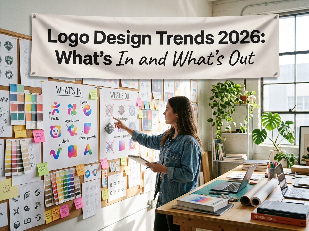
Every year brings a fresh wave of logo design predictions, and 2026 is no exception. Some of this year’s directions are sensible responses to how logos now live — on small screens, in app grids, in a dozen formats at once. Others are simply fashion. This roundup separates the two: what is in, what is out, and how to borrow from the moment without building your whole identity on it.
A trend is a tool, not a strategy. The marks that age well use current techniques to serve a clear idea, instead of chasing whatever is loudest this year. So judge each direction below against three things: your business, your audience, and the sizes at which your logo actually appears.
What’s In for 2026
Ultra-simple marks. Logos keep shedding detail: fewer lines, bolder shapes, nothing that cannot survive at favicon size. The driver is the phone — most first encounters happen on a small screen, where intricate marks blur into mush. This suits digital-first businesses and anyone whose logo mostly appears small. The caution: simple must not slide into generic. Strip back to one strong idea, not to no idea at all.
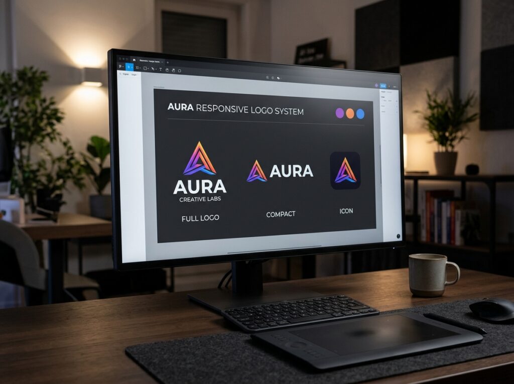
Responsive logo systems. Instead of one fixed logo, brands are commissioning a small family designed together: a full lockup, a compact version and an icon. It is rising because no single layout serves both a billboard and an app icon well. It suits growing businesses with many touchpoints. The caution is discipline — the versions must be designed as a system from the start, not improvised later by cropping the main logo.
Expressive custom lettering. Hand-finished and customised letterforms are back, giving wordmarks a personality that stock typefaces cannot. Businesses want details competitors cannot simply download, and lettering delivers them. It suits consumer brands with a strong voice — food, drink, retail, creative services. The caution is legibility: character is worthless if customers cannot read the name at a glance, so test the lettering small and at a distance.
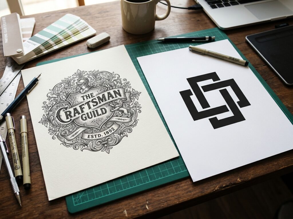
Retro revivals, used carefully. Designers are borrowing the warmth of 1970s lettering, heritage badges and vintage palettes. In a market of polished sameness, nostalgia and craft stand out. It suits brands with a genuine story — makers, independents, hospitality businesses with roots. The caution is honesty: retro styling on a business with no heritage behind it reads as costume, and dates as quickly as any other fashion.
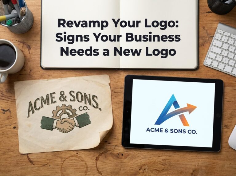
If reading this has you eyeing your own logo, the usual answer is a refresh rather than a reinvention. A step-by-step redesign approach shows how to modernise a mark while keeping the recognition it has already earned — evolution you control, not a leap.
What’s Out for 2026
Over-detailed marks. Intricate crests, hairline strokes and tiny explanatory details are fading, because they fail exactly where logos now work hardest: small, fast and in a single colour. If a mark needs a magnifying glass, it is carrying detail nobody receives. Detailed artwork still has a place — in illustration, packaging and signage — just not inside the logo itself.
Generic gradient blobs. The soft abstract swoosh in a blue-purple gradient, interchangeable across a hundred start-ups, has worn out its welcome. It is fading because it says nothing ownable: swap the name underneath and nobody would notice. A design that could belong to any business in your sector belongs to none of them — and being recognised is the logo’s whole job.
Copying fashion wholesale. The quickest route to looking dated in 2028 is adopting 2026’s look entire: the fashionable typeface, layout and palette all at once. Wholesale copying fades fastest because none of it was ever yours — there is no idea underneath to survive the fashion. Borrow a single technique that fits; leave the full costume to brands content to redesign every two years.
How to Use Trends Without Dating Your Brand
Start from the idea, not the trend list. Decide the single impression your logo must leave, then take from 2026 only what strengthens it. The habits behind memorable logos — simplicity, versatility, honesty about your audience, testing at real sizes — outlast every trend cycle; our tips for designing a memorable business logo set them out in full.
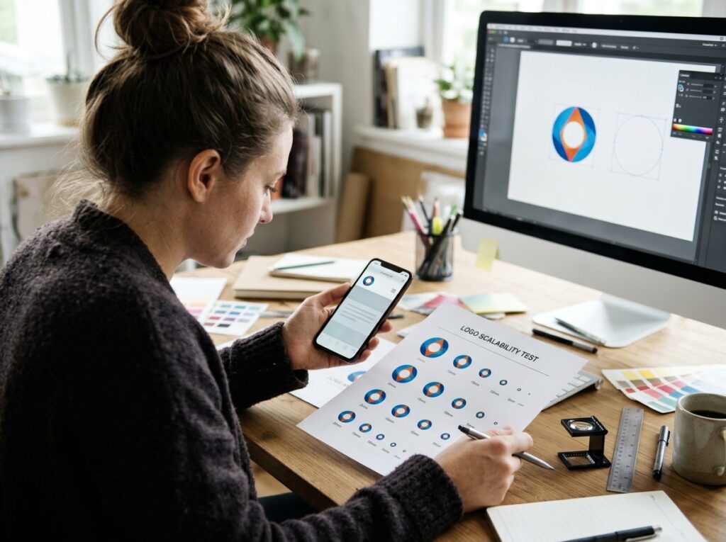
Keep trends in the layers that are cheap to change. Your core mark should be the most conservative thing you own; let packaging, social templates and campaign graphics carry the current flavour. And whatever you adopt, test it first at favicon size and in plain black and white — if it fails there, it is decoration, not design.
Quick Checklist
- Each trend judged against your audience, not just taste
- Core mark kept simple enough for favicon size
- Only one current direction borrowed, not the whole look
- Trends placed in packaging and templates, not the core mark
- Custom lettering tested small and at a distance
- Logo still works in plain black and white
Frequently Asked Questions
Should I redesign my logo just to follow a trend?
Almost never on its own. Redesign when the logo fails practically — at small sizes, in one colour, or because the business has changed. If a current technique fixes a real failure, use it; if the logo works, a trend is not a reason to spend recognition you have already built.
How long do logo trends last?
Surface fashions turn over in a couple of years; the pressures underneath them last far longer. Small screens are not going away, which is why simplicity keeps returning. Bet on the pressures, not the surface.
Can a trend-led logo still look professional?
Yes — if one idea leads and the trend supports it. Trouble starts when several fashions compete inside one mark, or when the style fights the business: playful retro lettering on a firm that sells trust and caution, for example.
Conclusion: Borrow the Technique, Keep the Idea
Trends are best treated as a wardrobe of techniques, not as instructions. Take the responsive versions, the disciplined simplicity, the lettering with character — and leave the costumes. A logo built on a clear idea can wear 2026 lightly and still look like itself in 2036.
If you would like a mark designed to outlast the trend cycle, Designores is a full-service design studio with 1,600+ projects completed for 900+ companies, and logo design is at the heart of what we do. Get in touch when you are ready.


One Comment