3 Essential Elements of a Strong Startup Logo

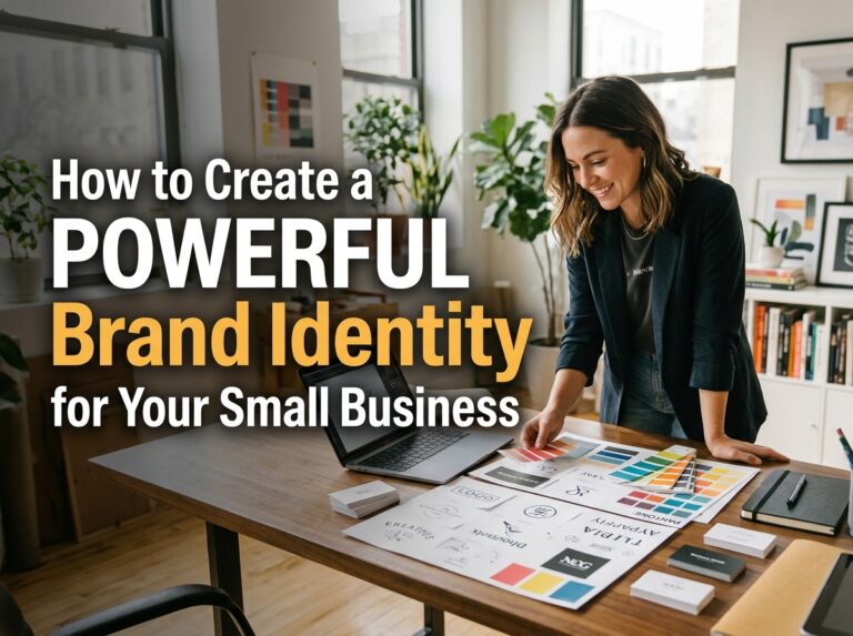
A startup logo has a hard job. It must introduce a business nobody knows yet, look credible from the first day, and keep working as the company grows. Founders often respond by asking the logo to do too much — more detail, more colours, more meaning packed in. In practice, the logos that last share three essentials: they are simple, they are relevant to the people they serve, and they are versatile enough to work anywhere. Get those three right and the logo becomes part of creating a powerful brand identity from the start.
Element 1: Simplicity
Simple does not mean plain, and it certainly does not mean boring. It means the logo can be recognised in a glance and remembered afterwards. A simple mark uses few shapes, clean lines and no detail that disappears when the logo shrinks. Think of where it will actually be seen: a tiny profile picture, a favicon, an app icon among dozens of others. At those sizes, fine lines blur, small text vanishes and clever detail turns to noise.
Simplicity also makes a logo easier to reproduce: a mark built from clean shapes can be printed, embroidered, etched or set in a single colour without falling apart. When reviewing concepts, apply the memory test — look at the logo for a few seconds, look away, and try to sketch it. If you cannot, your customers will not remember it either.
Element 2: Relevance to Your Audience and Market
A logo should look like it belongs to your business and speaks to your customers. Relevance comes from understanding who you serve and what they expect. A children’s clothing brand can be playful and rounded; a firm offering financial advice needs to feel steady and precise. Neither is better — each fits its audience. Problems start when a founder designs for personal taste instead of for the people who will buy.
Research your market before you brief a designer. Look at what competitors use, not to copy them, but to see the visual language customers already understand in your sector — and where there is room to stand apart. Then test concepts on real customers where you can — their reaction matters more than the opinion of friends who already know and like you. Relevance also means honesty: a logo that promises more than the business delivers undermines trust. For more on choosing well, these practical logo design tips are a useful companion.

Element 3: Versatility Across Sizes and Media
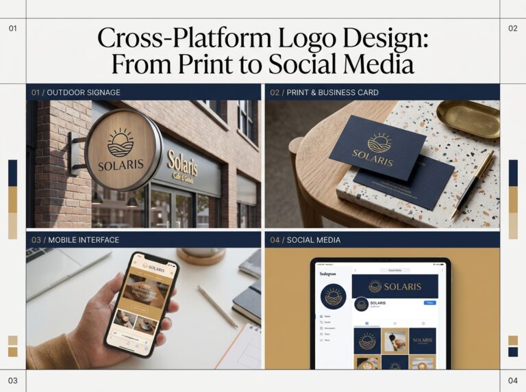
Your logo will live in far more places than your website header. It needs to work on signage, packaging, invoices, social media, uniforms and merchandise — large and small, in colour and in black and white, on light backgrounds and dark ones. A versatile logo is designed as a small system, not a single picture: a primary version, a compact version for tight spaces, and an icon-only version for avatars and favicons.
Ask for the right files from the start: vector files (such as SVG, EPS or PDF) that scale without losing quality, plus PNG versions with a transparent background. Check the logo in one colour, reversed out of a dark background, and at the smallest size it will ever appear. If it only works in full colour at large sizes, it is not finished yet.

Common Startup Logo Mistakes
Copying a bigger brand.
Borrowing the look of a successful company makes you look like an imitator, and can create legal trouble. Take inspiration from the qualities you admire, not the artwork itself.
Following a short-lived trend.
A fashionable effect can date your logo within a couple of years. Let trends influence your marketing materials, which are cheap to refresh, rather than your core mark.
Designing in isolation.
A logo approved on a blank screen may fail on your packaging or shopfront. Always review concepts in realistic mock-ups of where the logo will actually be used.
Skipping the paperwork.
Agree who owns the final artwork and make sure you receive the full file set. A single low-resolution image is not a logo package.

Quick Pre-Launch Checklist
- The logo is recognisable at favicon and profile-picture size
- It works in plain black and in white on a dark background
- It has been tested with the customers you actually serve
- You have primary, compact and icon-only versions
- You hold vector files plus PNG versions with transparent backgrounds
- The design is original and does not imitate a competitor
- It has been checked in realistic mock-ups, in print and on screen
Conclusion
Simplicity, relevance and versatility are not glamorous, but they are what separate a logo that lasts from one that needs replacing within a year. Spending a little more thought at the beginning saves a costly redesign just as the business is gaining recognition. If you would like help getting the essentials right from day one, Designores offers logo design services for startups and growing businesses — get in touch when you are ready.